
By Catherine Austin Fitts
My “go to” website for technical analysis of precious metals, the US dollar & the US stock market is Rambus Chartology, where Rambus (that’s his handle – he’s the founding technical analyst) leads a discussion with extensive charts of what the markets are saying.
In January 2016, Rambus launched his quarterly Solari Report with a Blockbuster Chartology. You can find links to the entire series of quarterly and annual Blockbuster Chartologies at the end of this latest piece.
One of the reasons that Rambus is so good at his craft is that he focuses on “staying on the right side of the major trend.” The challenge of doing so at this time is that it is tempting to look for bottoms or to assume that the trend upwards in the US dollar or stock market may be over. However, Rambus consistently brings us back to the discipline of the Chartology. What does price tell us? As he describes so aptly, we are dealing with psychological warfare.
Sitting back once each quarter to get this perspective offers invaluable insight. So, here we go for the 2nd Quarter 2021 Blockbuster Chartology!
Blockbuster Chartology Quarterly Report
By Rambus
~ 2nd Quarter 2021 Wrap Up ~
US and World Stock Markets
Commodities
PM Complex
US and World Stock Markets
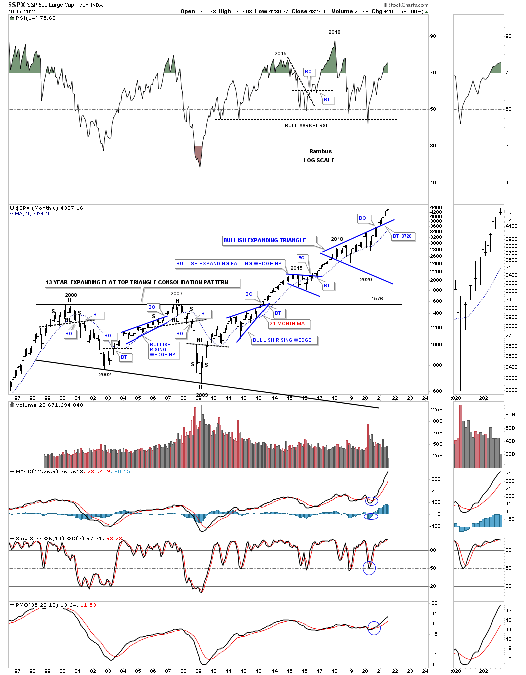
Since this is part of the Quarterly Report our main focus will be on the longer term monthly charts which puts the big picture in perspective. What happens in the markets tomorrow or next week is for the shorter term investors to figure out. Until something changes the long term look remains bullish.
So far, in regards to the US stock markets I don’t see any yellow warning flags yet just some chopping action for the most part. There has been some strong rotation from some of the stronger sectors that led the markets out of the March 2020 crash low to some of the lagging sectors. This is usually a healthy development in the long term.
I realize that many investors are bearish on the stock markets and that is understandable since our current secular bull market began in 2009. How can the stock markets keep going up? It is called the wall of worry. Bull markets are punctuated with selloffs from time to time that is needed to work off overbought conditions and to keep investors wondering if this time the bear market is really going to start.
I’m not going to go into great detail as we’ve been following these long term charts for many years. We’ll start with the US stock markets and then look at some of the world stock markets as they all tend to move together to a certain degree.
Let’s start with the SPX as it is the most important stock market in the world. This shorter term monthly chart shows the 13 year flat top expanding triangle that launched the SPX on its current secular bull market beginning at the 2009 crash low. Maybe we are seeing the bull market top but from this altitude we still haven’t seen a lower monthly low vs the previous monthly low.
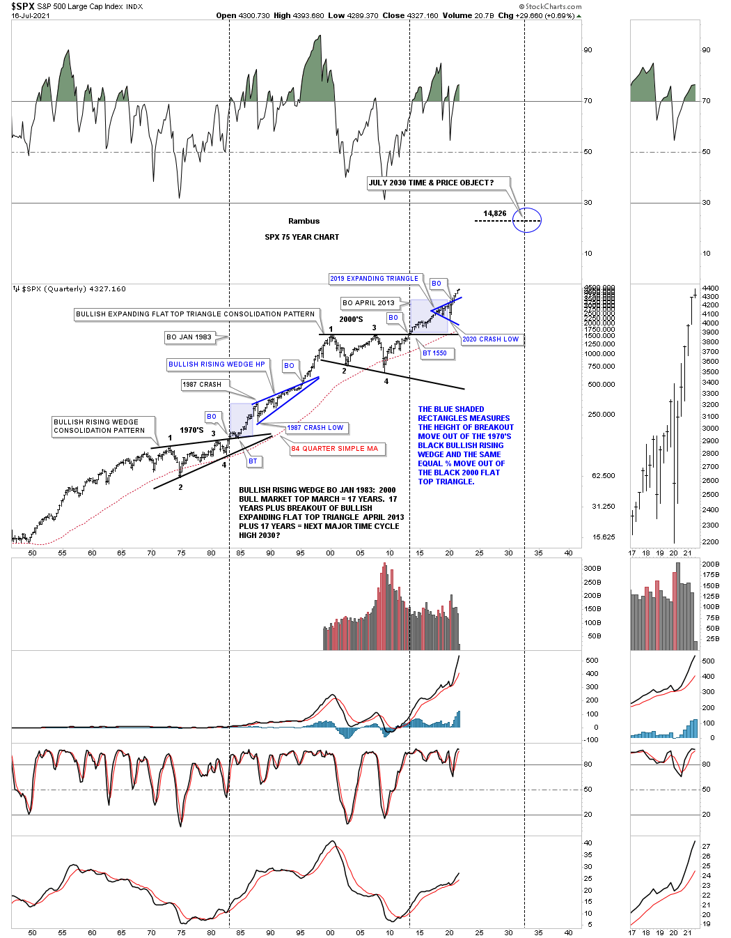
The 75 year quarterly chart for the SPX.
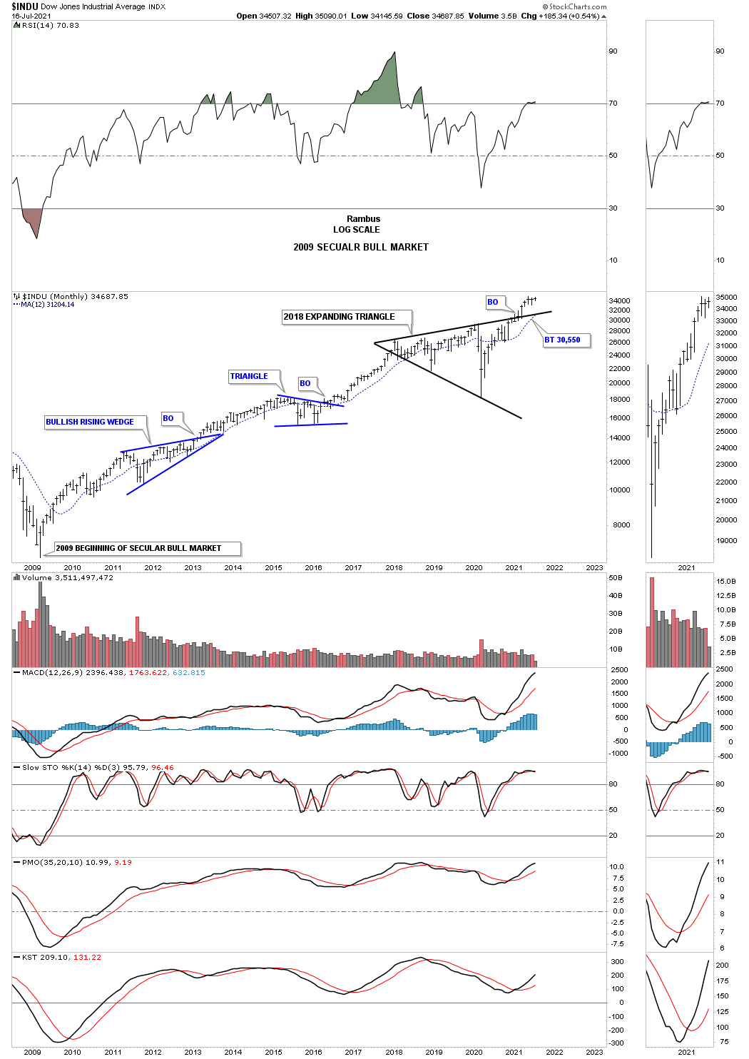
The INDU secular bull market that began at the 2009 crash low.
From this 75 year quarterly bar chart perspective the breakout from the blue expanding triangle is just getting underway.
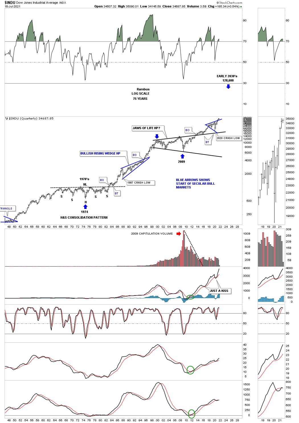
Above the top rail of the 2000 uptrend line is bullish and below is bearish.
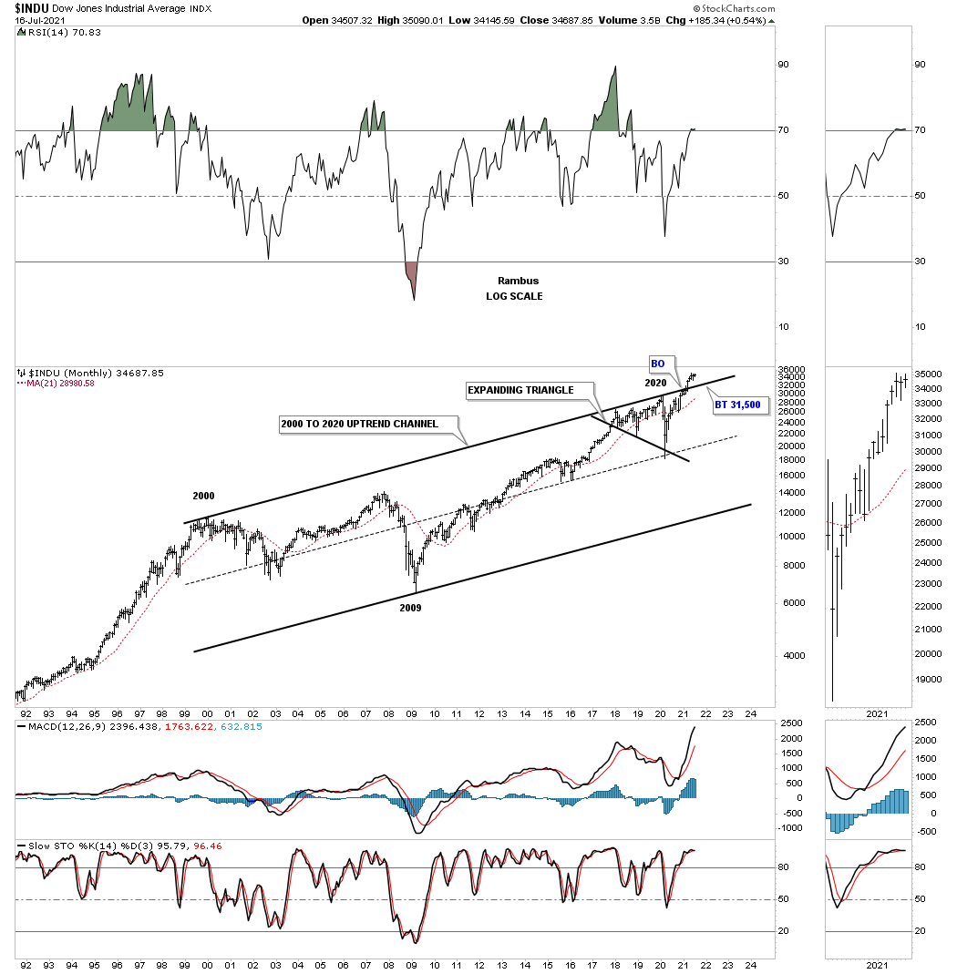
Below is another view I’ve never shown you before.
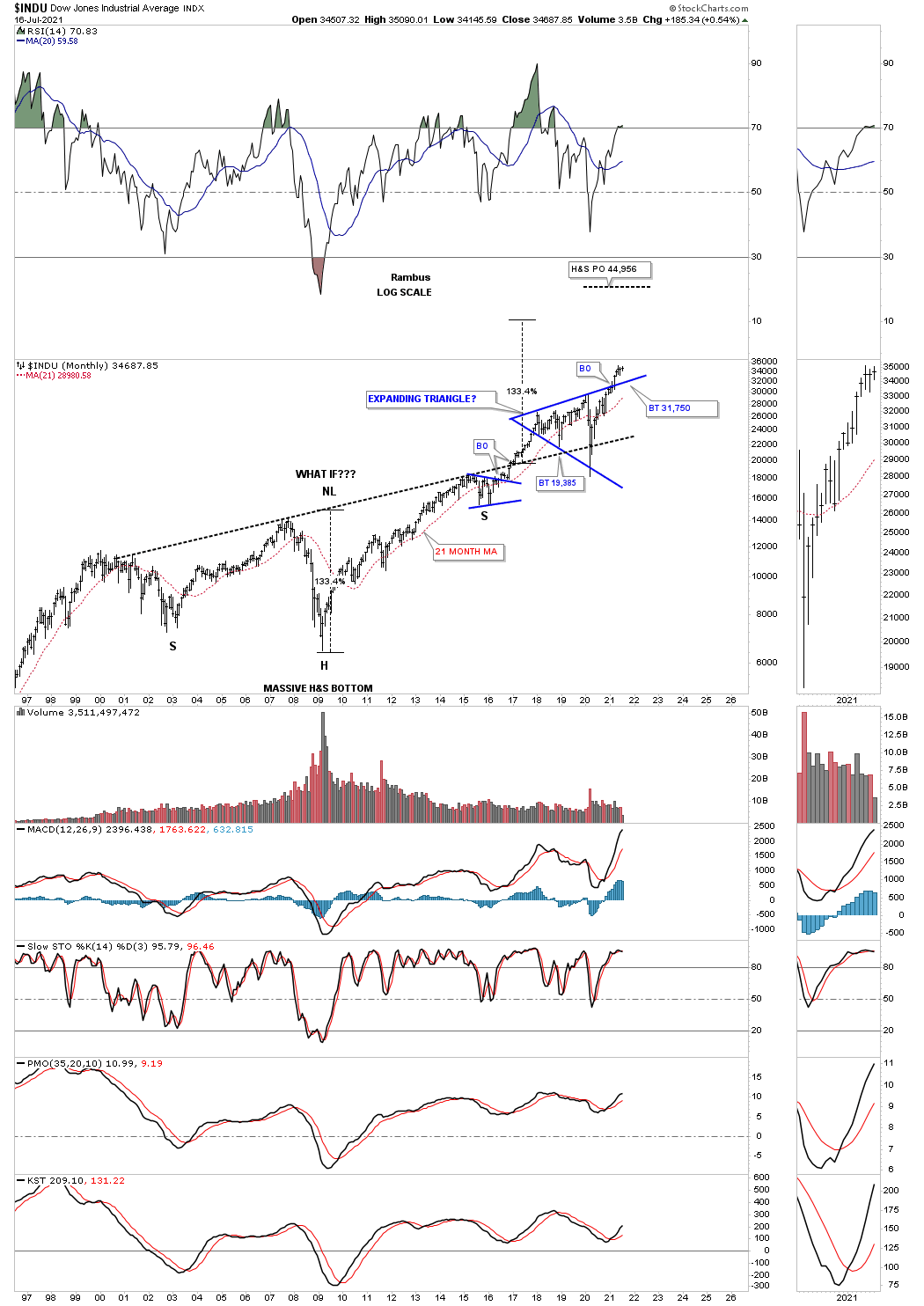
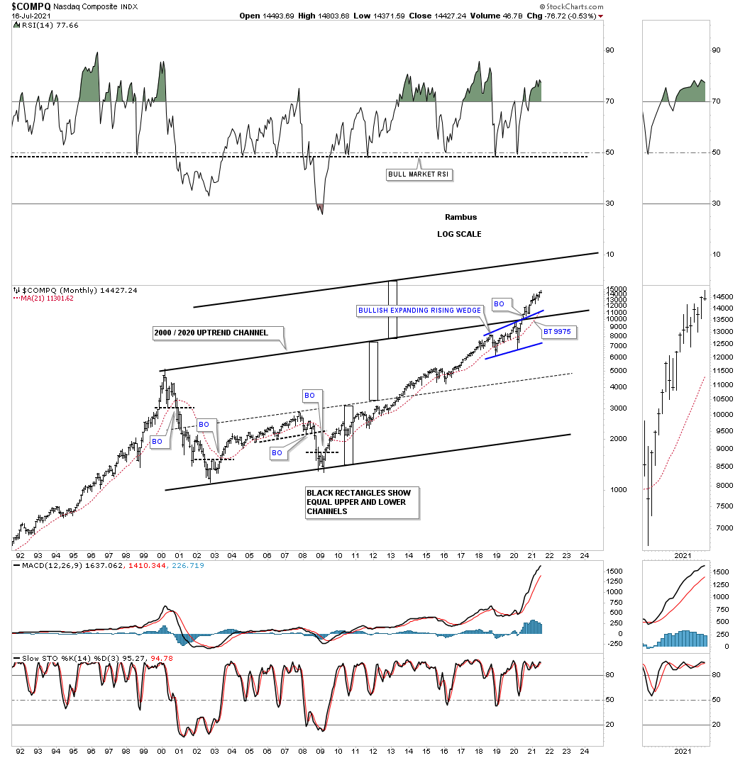
COMPQ massive H&S bottom.

This chart for the COMPQ is similar to the INDU chart above which shows a possible doubling of the lower channel as shown by the black rectangles.
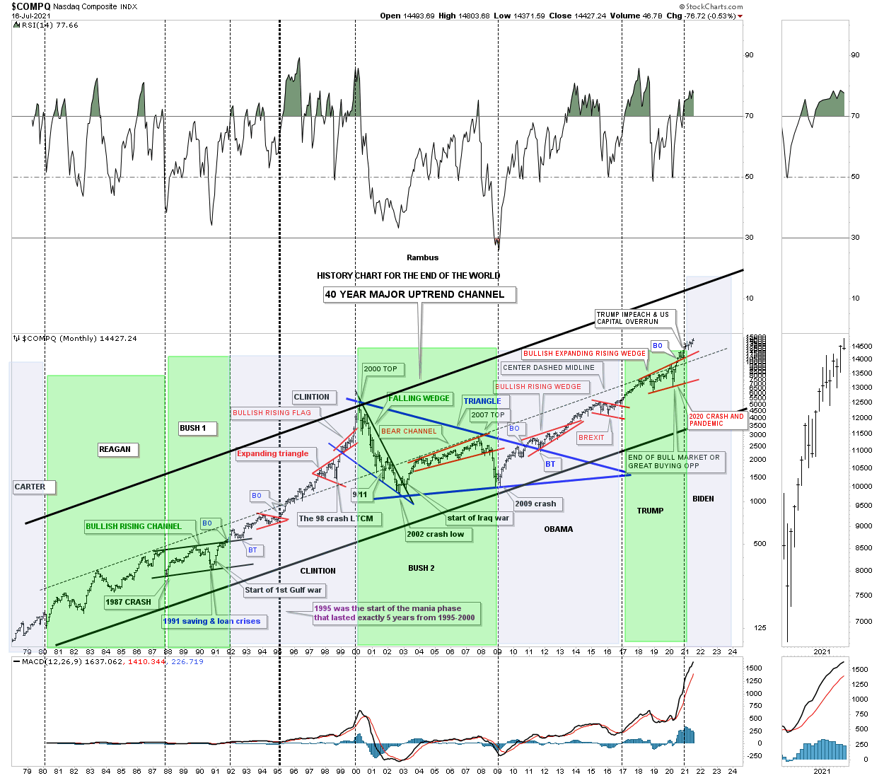
This last chart for the COMPQ I call the, History Chart For the End of the World, which is a satirical look at all the lows which felt like the end of the world if you were trading in real time when they occurred. I last updated this chart at the 2020 crash low and asked the question, “is this the end of the bull market or a great buying opportunity?” So far it has been a great buying opportunity.
Also the green shaded areas show what the stock market did under a republican president and the pink shaded area shows what happened during a Democratic president. I also made this prediction on the day of the 2020 election. I said it wouldn’t make any difference who was elected president and that the stock market would be higher a year from November 3rd 2020. We’ll know in less than 4 months if this prediction comes true.
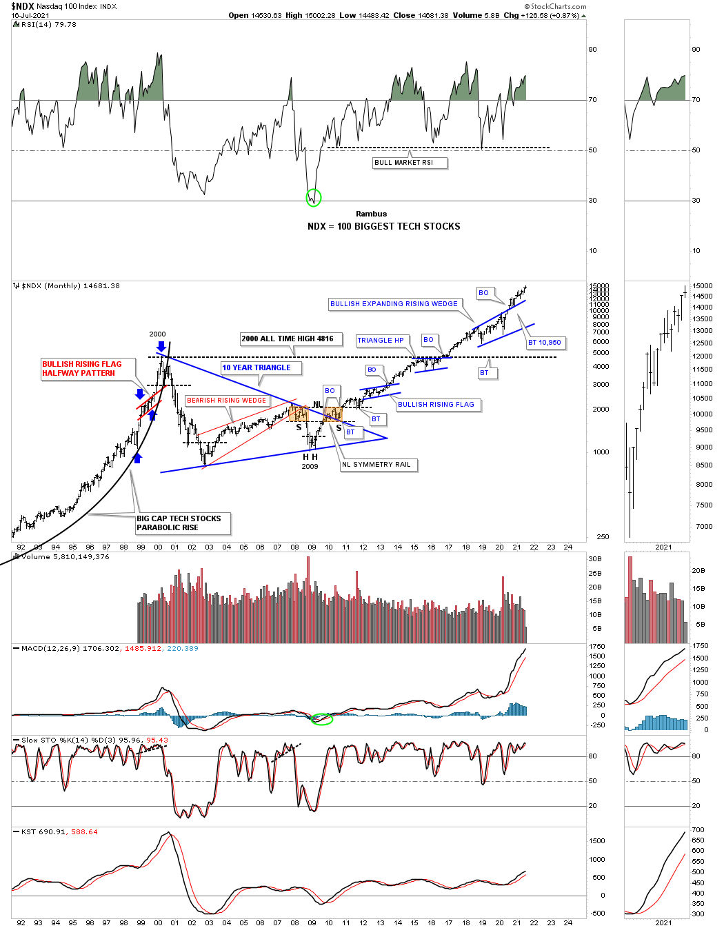
This monthly chart for the NDX 100 shows some beautiful Chartology starting with the little red bullish rising flag halfway pattern that showed where to look for a possible top in the 1974 to 2000 secular bull market. The 10 year blue triangle consolidation pattern was needed to consolidate the previous secular bull market before it was ready to launch the next secular bull market that began at the 2009 crash low. Note the classic H&S bottom that formed at the end of the 10 year triangle with the left shoulder and head forming inside of the blue triangle with the right shoulder low forming on the backtest to the top rail.
Another piece of Chartology we discuss shows how a small consolidation pattern can many times form just below an important trendline which gives the stock the energy it needs to finally takeout overhead resistance as shown by the blue triangle just below the all time highs.
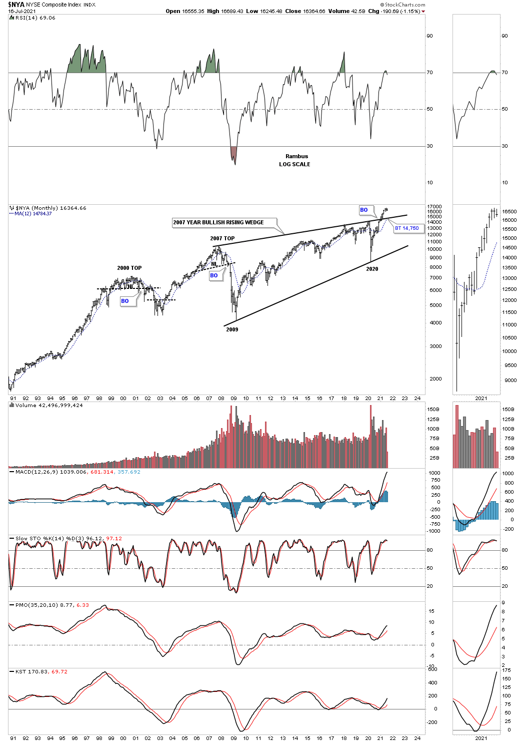
The NYA is setup a bit differently than some of the other US stock markets. While many of the US and world stock markets broke out their massive 2000 consolidation pattern in 2013 the NYA has just recently broken out from its bullish rising wedge in January of this year.
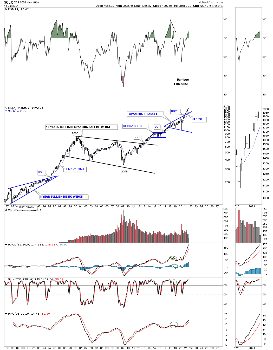
OEX 100.
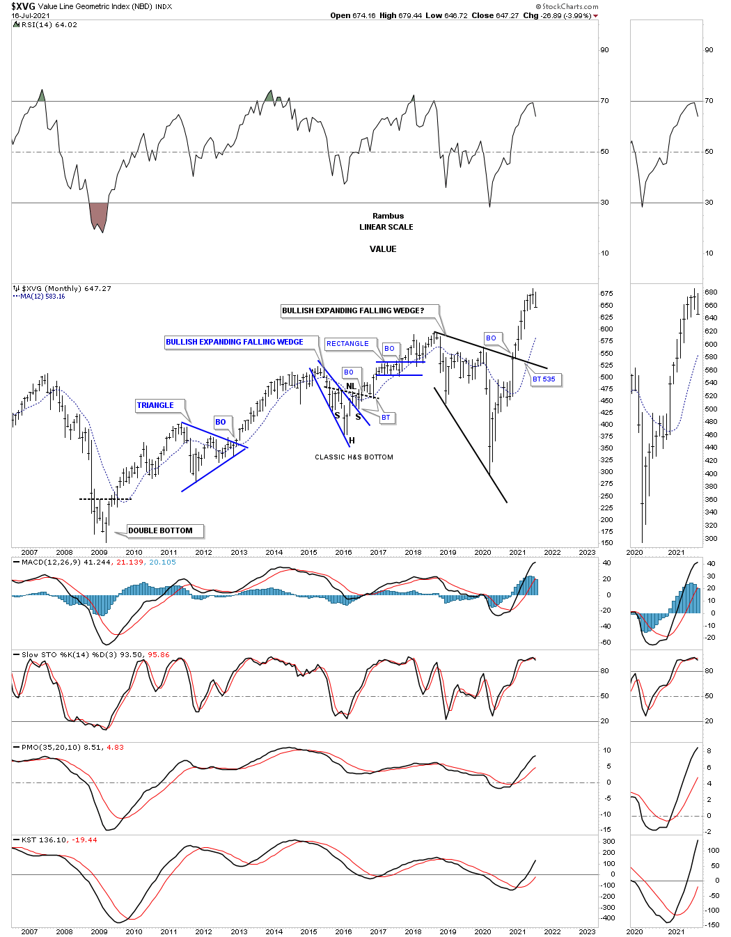
XVG value index.
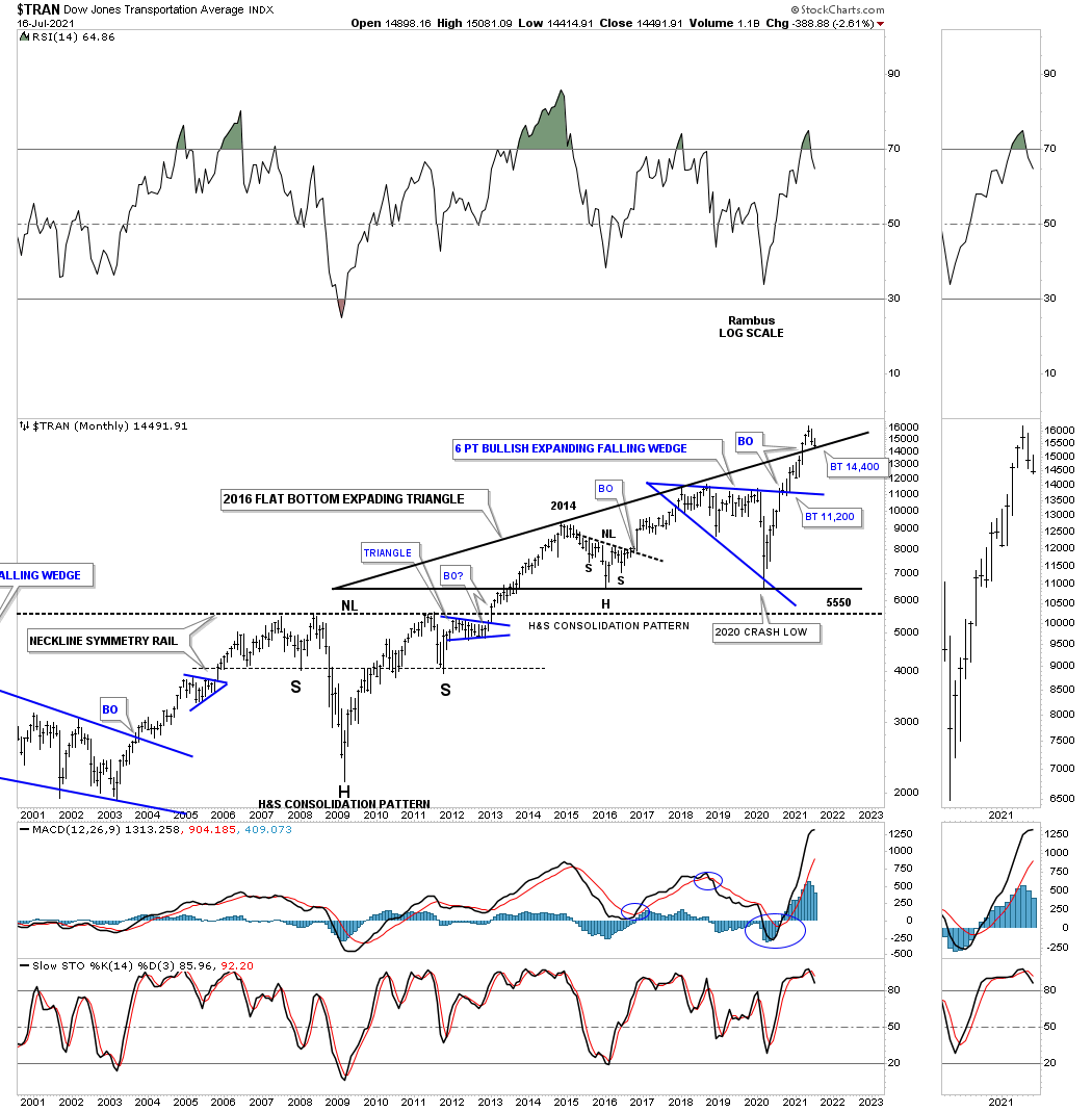
The Transportation Average is in backtest mode.
I’ve been saying since the 2020 crash low that it wouldn’t be just the US stock markets that are going to rally to new all time highs, but most of the world stocks markets will also follow along for the ride.
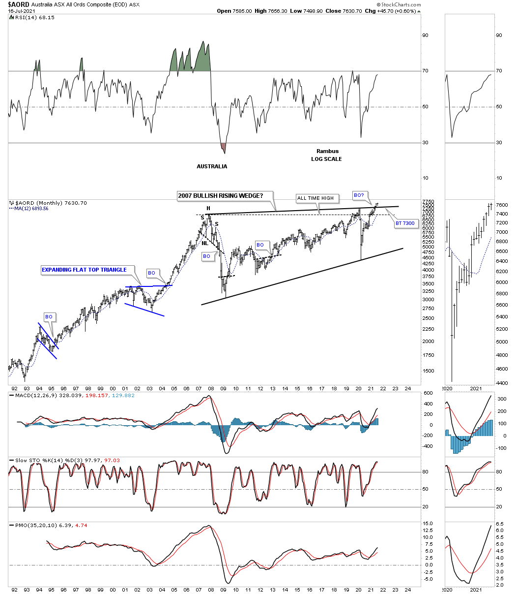
AORD, Australia stock market which is a commodity related stock market is in the process of breaking out and backtesting the top rail of its 2007 bullish rising wedge.
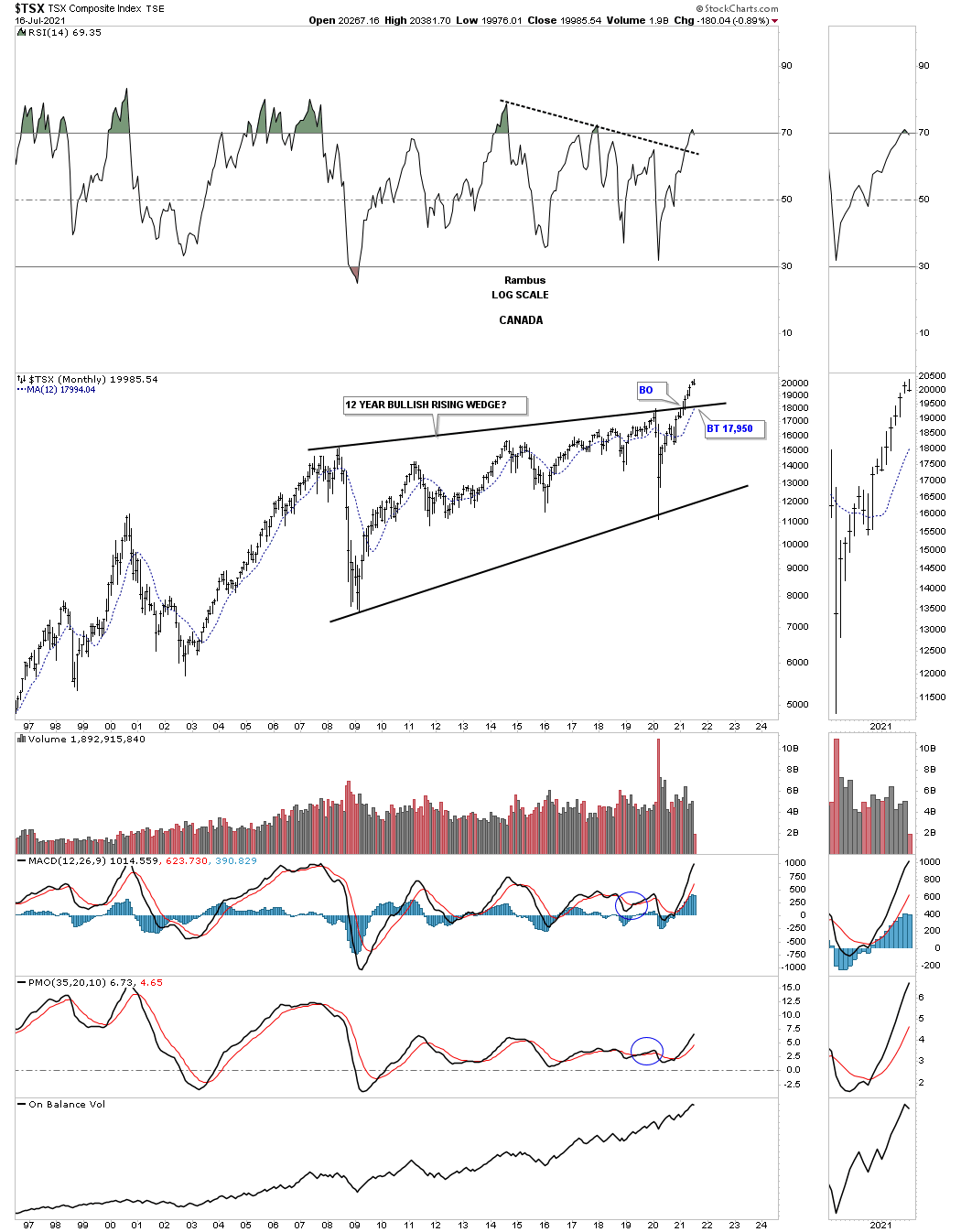
Another commodity related stock market is the, Canadian TSX, which has also broken out from its own 2007 bullish rising wedge and is a bit further along than the AORD.
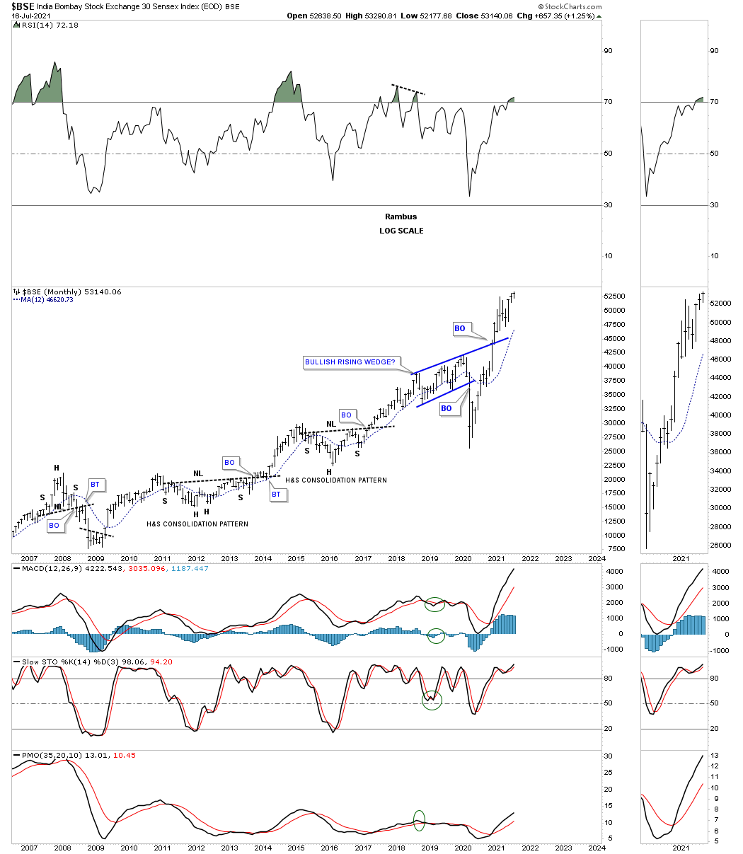
Below is the BSE, Bombay stock exchange, which is trading at a new all time high this month.
The BVSP, Brazilian stock, market found support on the top rail of its 10 year triangle consolidation pattern during the 2020 crash low.

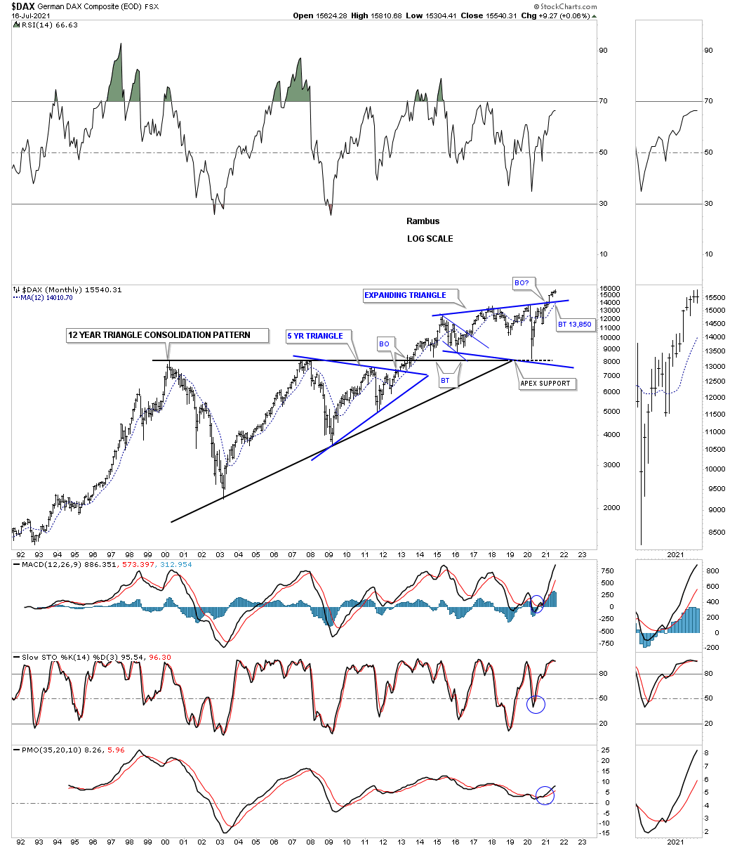
Another world stock market that found support at the apex of its 12 year triangle consolidation pattern is the DAX, German stock market, now in breakout and backtest mode.
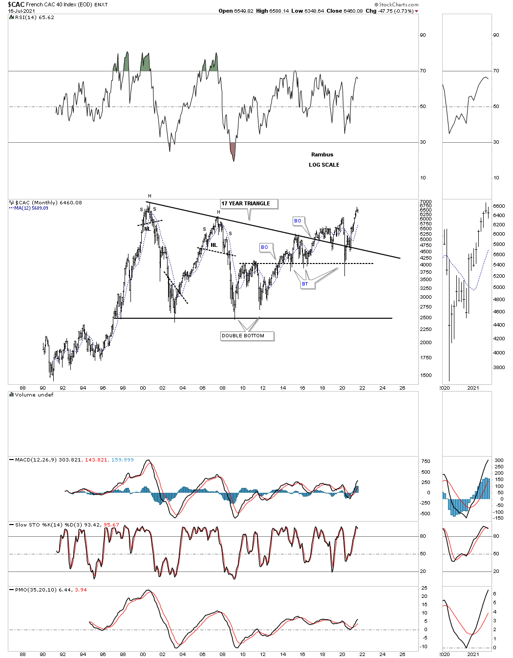
CAC French stock market.
The TWII, Taiwan stock market, built out the largest consolidation pattern I’ve ever charted. Note where the 2020 crash found support before moving sharply higher.

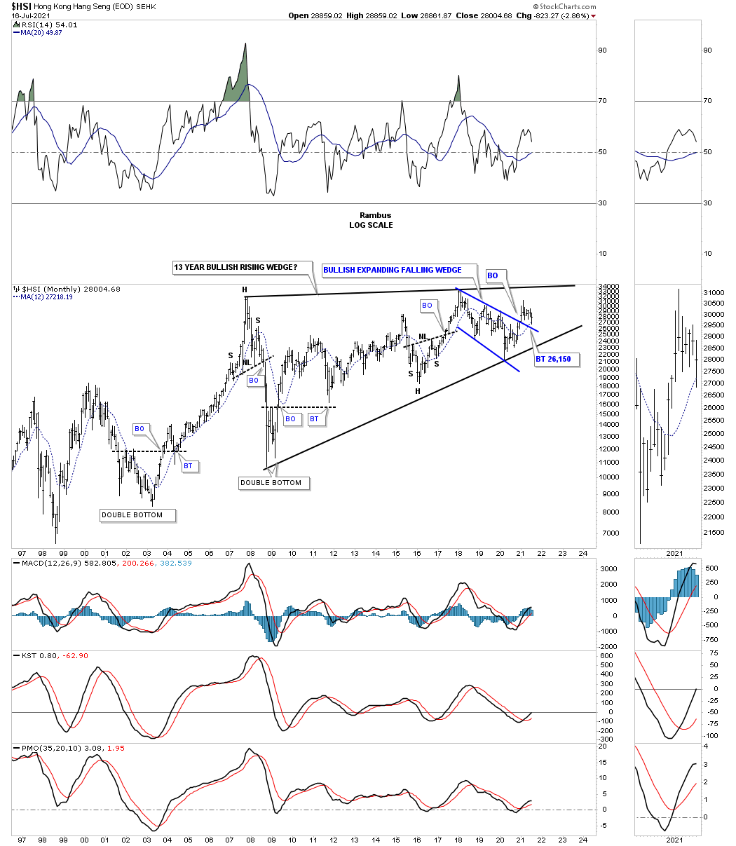
The HSI, Hong Kong stock market, is still trading inside of its 13 year rising wedge formation and is currently in backtest mode to the top rail of the blue expanding falling wedge and the 12 month sma.
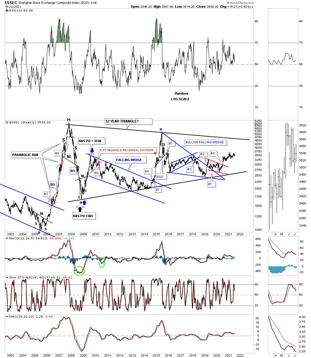
The SSEC, Shanghai stock market, is trading in the middle of no man’s land.
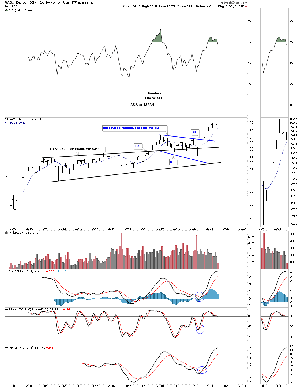
Next is the AAXJ, Asian stock markets ex Japan, still looks in good shape.
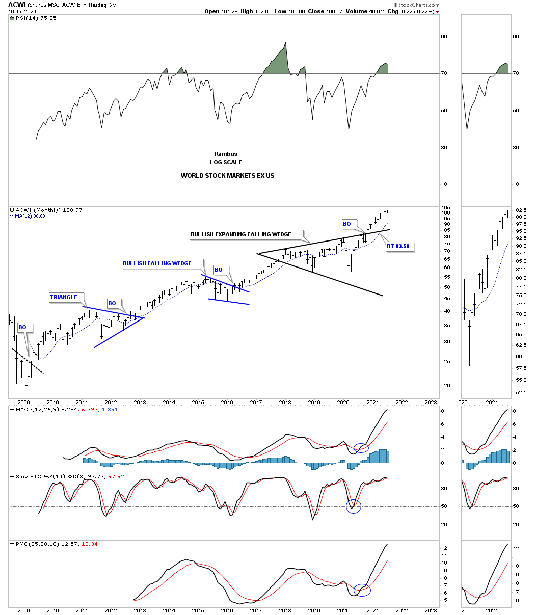
ACWI, All world stock markets ex the US made a new all time high this month.
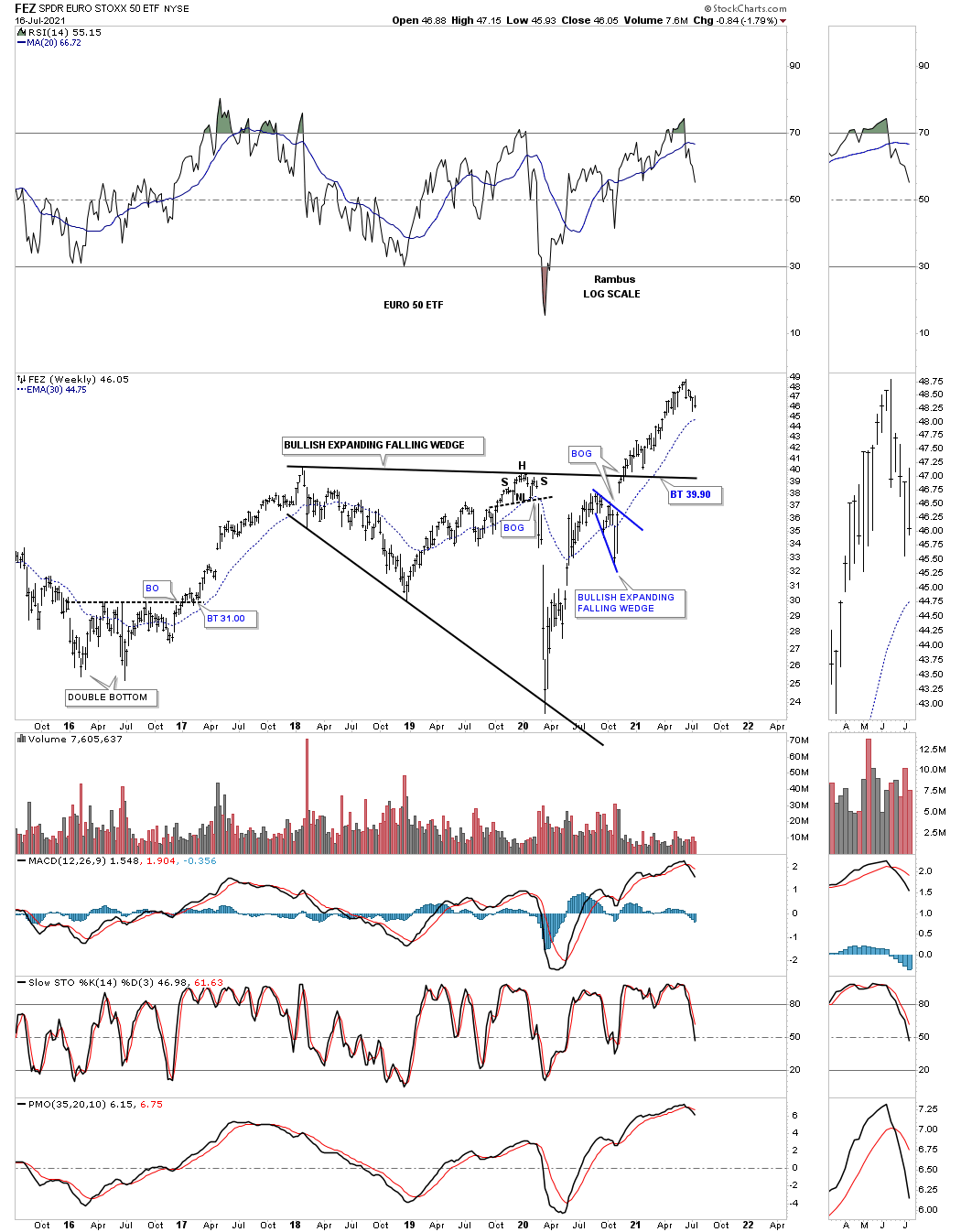
FEZ is the, EURO STOXX 50 etf, which experienced a large impulse move after breaking out from the bullish expanding falling wedge back in November of 2020.
Even the RSX, Russian stock market, is showing some bullish chartertnstics with a possible H&S bottom in place. It looks like it is setup for a possible ping pong move between the top rail of the blue expanding triangle and the neckline.
This week we’ll look at some commodities and some US stock indices as part of the Quarterly Report. All the best…Rambus

Commodities
Back in June of 2020, several months after the panic crash low due to the Coronavirus, there was a chart pattern on many of the individual commodity charts that was beginning to show itself but in many cases still needed a little more work for confirmation. That pattern was the bullish expanding falling wedge that we’ve discussed many times which is one of the hardest chart patterns to spot early on. What makes these patterns so hard to find early on is for the fact that the last reversal point low is usually much lower than the previous low which makes the chart look broken.
These patterns also take out all the sell/stops on the last reversal point leaving no bears left to defend the bear market. If you’ve been in the markets for any length of time you know some of the best buying opportunities occur at panic lows which from a psychological perspective is very hard to buy into. Most investors and even many chartists have no clue that this pattern, the bullish expanding falling wedge, even exists and what is the general outcome if you find one.
Many times when one looks at the longer term charts for each sector they will see a dominate chart pattern that you will see on many of the subsectors. For instance most of the longer term charts for the US stock markets, going back to the 2018 high, have formed an expanding triangle or some similar patterns like a flat top or flat bottom expanding triangle. In commodities it was a bullish expanding falling wedge.
I’m going to do what I did last quarter and post the comments I made back in June of 2020 along with the chart I posted at that time and compare that chart and commentary to the present day as of July 19th 2021.
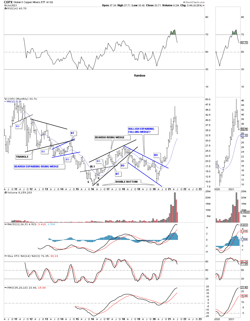
June 2020: This long term monthly chart for the COPX, Copper miners etf, is forming a possible bullish expanding falling wedge which could be part of a possible double bottom going back to the low in 2016.
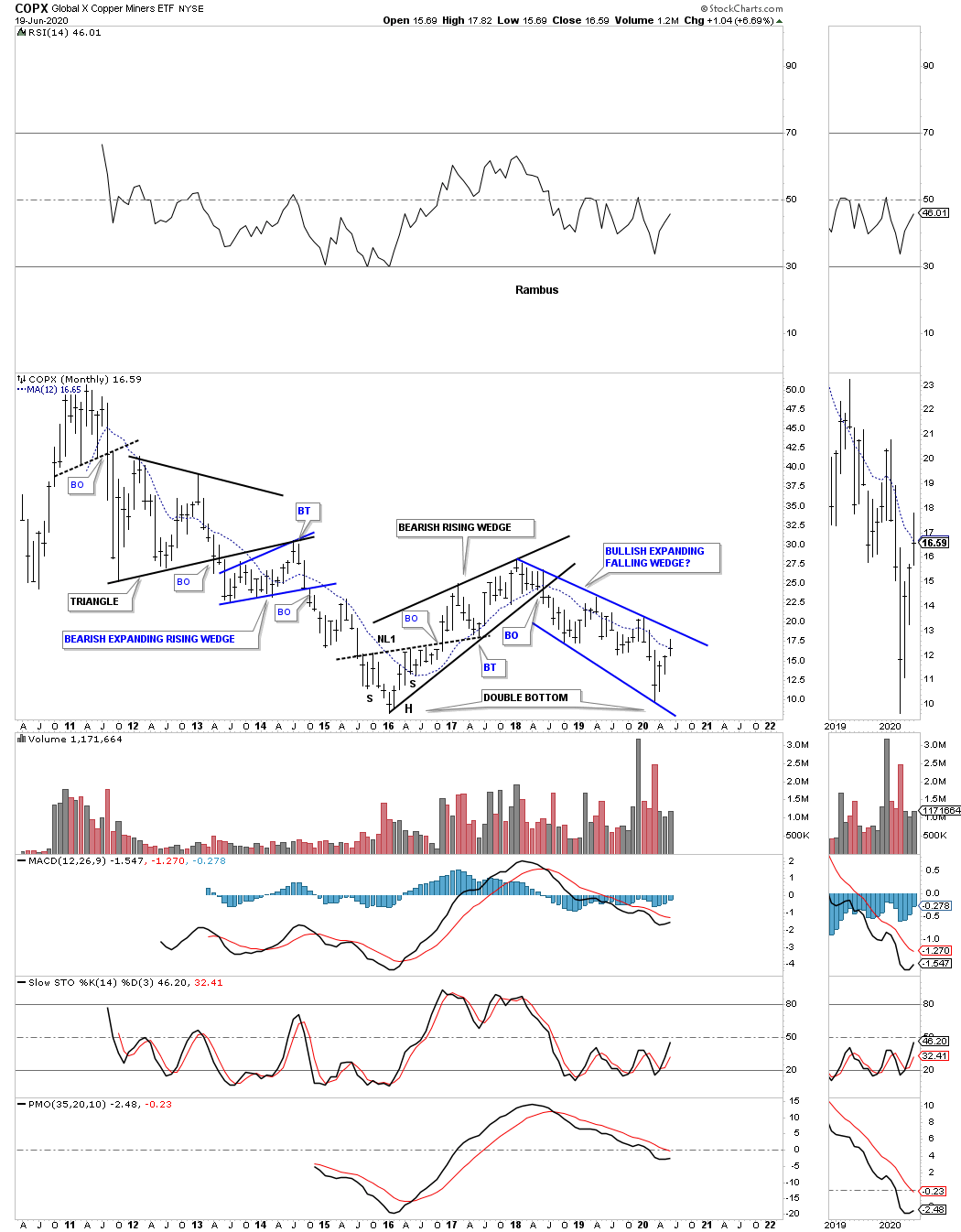
One year later on July 19, 2021:
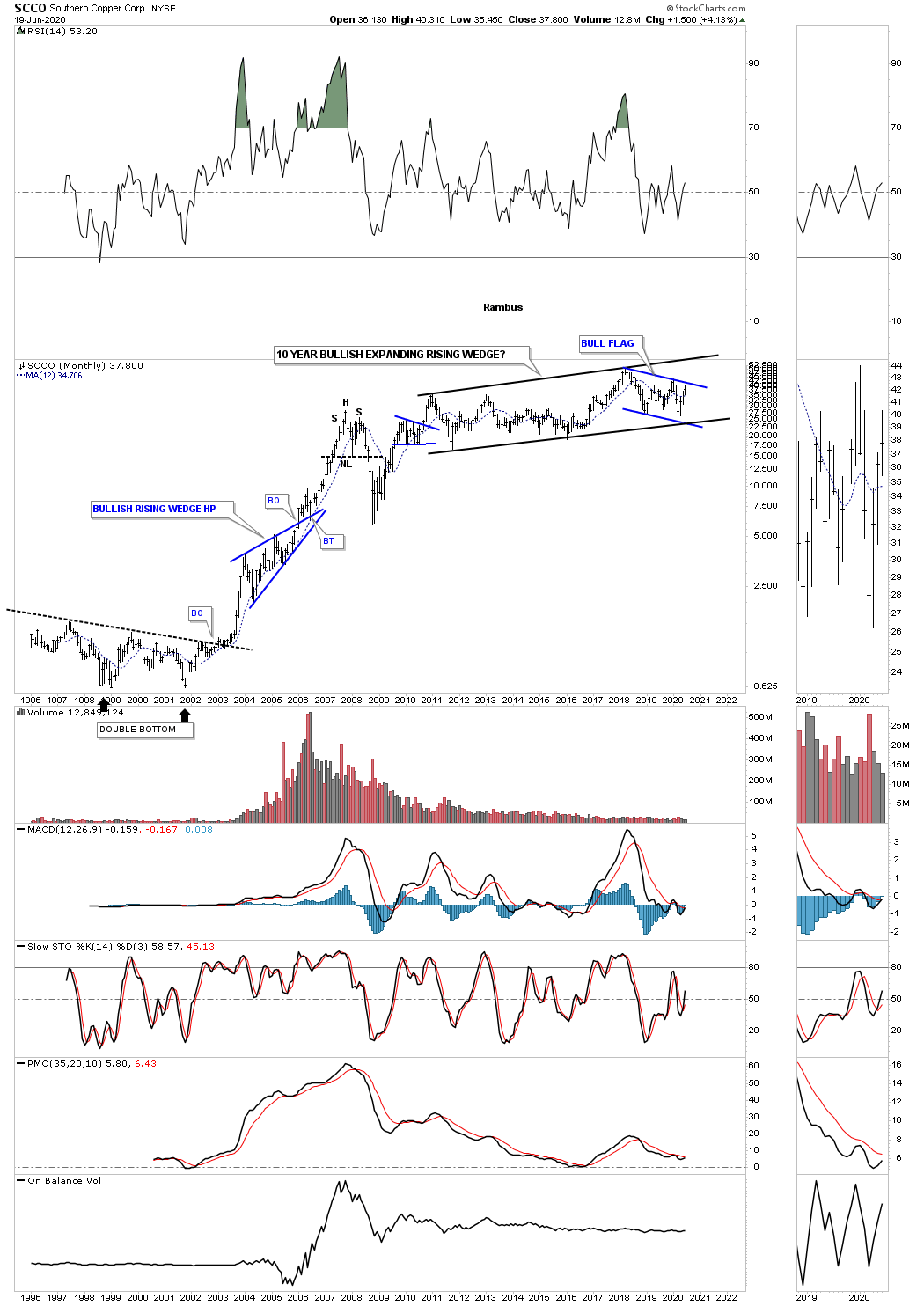
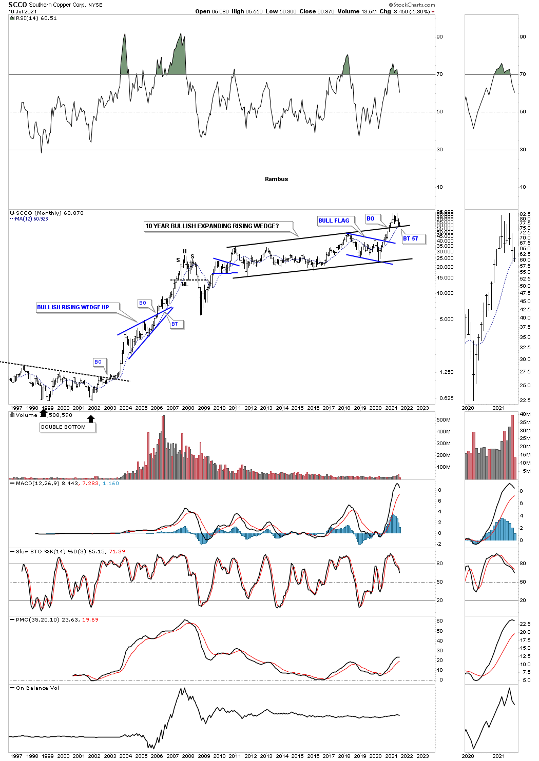
June 2020: SCCO, Southern Copper, has been building out a 10 year expanding rising wedge. A breakout of the blue flag will ensure a move to the top black rail which could then lead to a major breakout and much higher prices.
One year later on July 19, 2021:
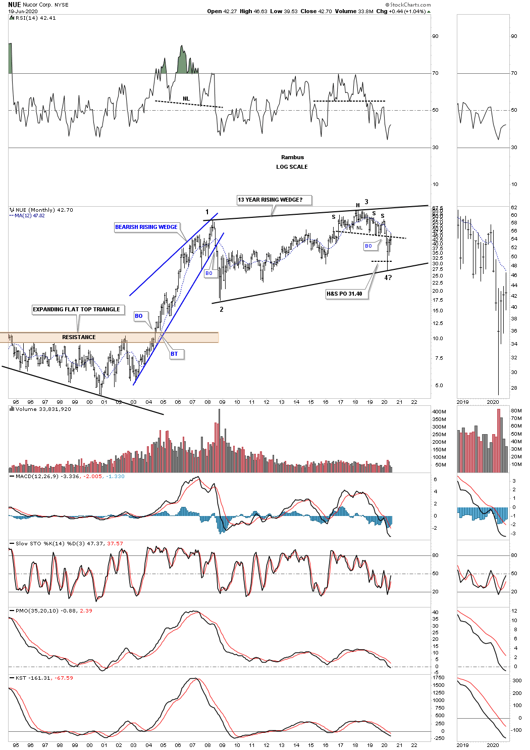
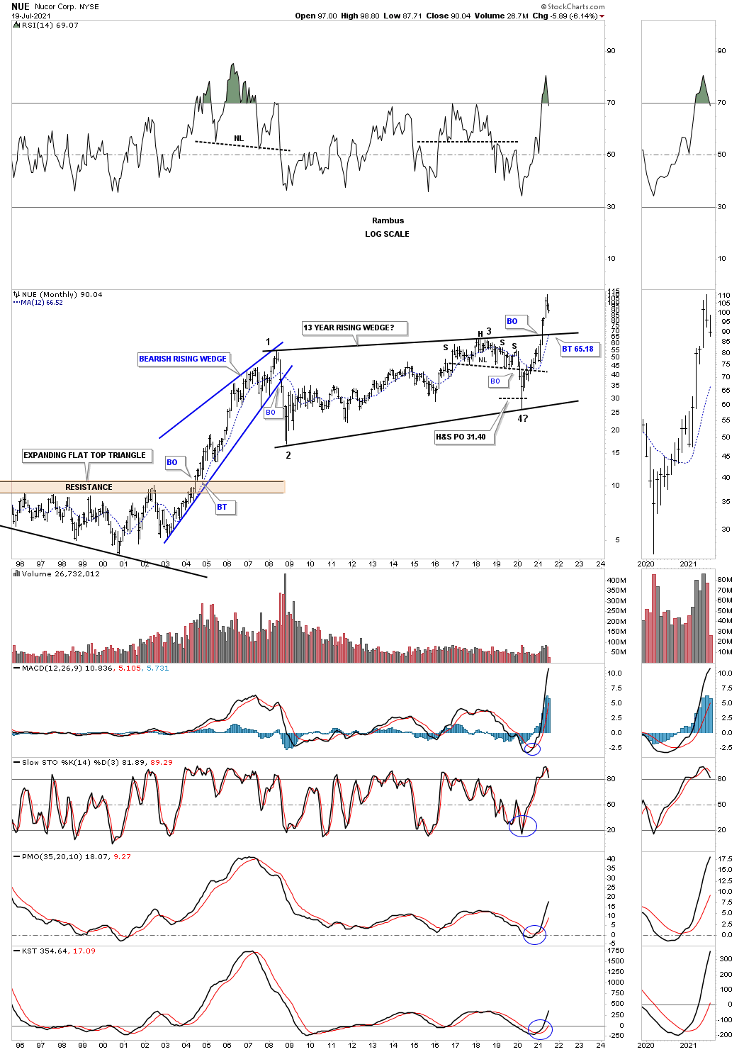
June 2020: Lets look at a few steel stocks as they have been consolidating for a long time. First is NUE which just finished putting in its 3rd reversal point after breaking down from the H&S top and reaching its measured move at 31.40.
One year later on July 19, 2021:
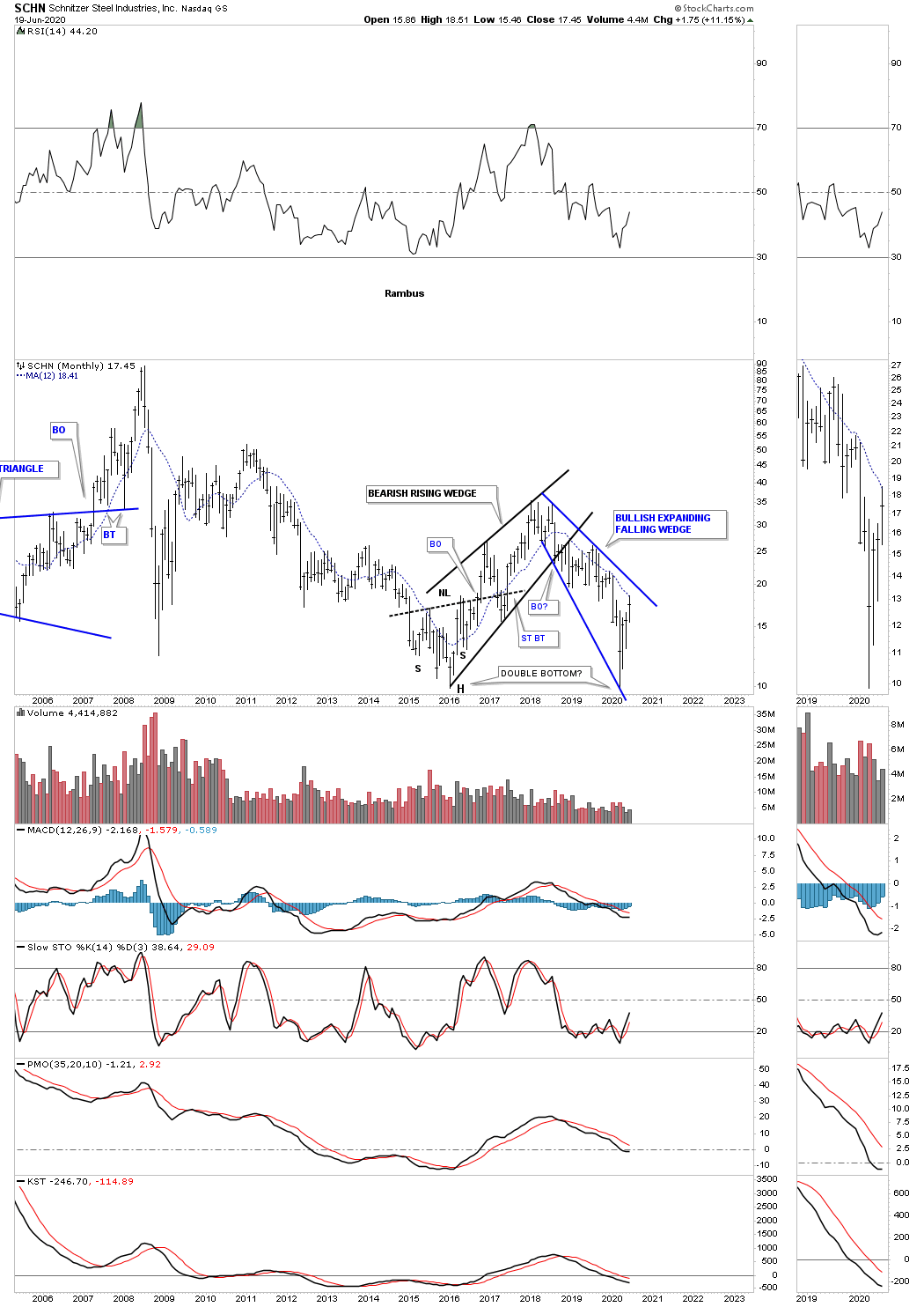
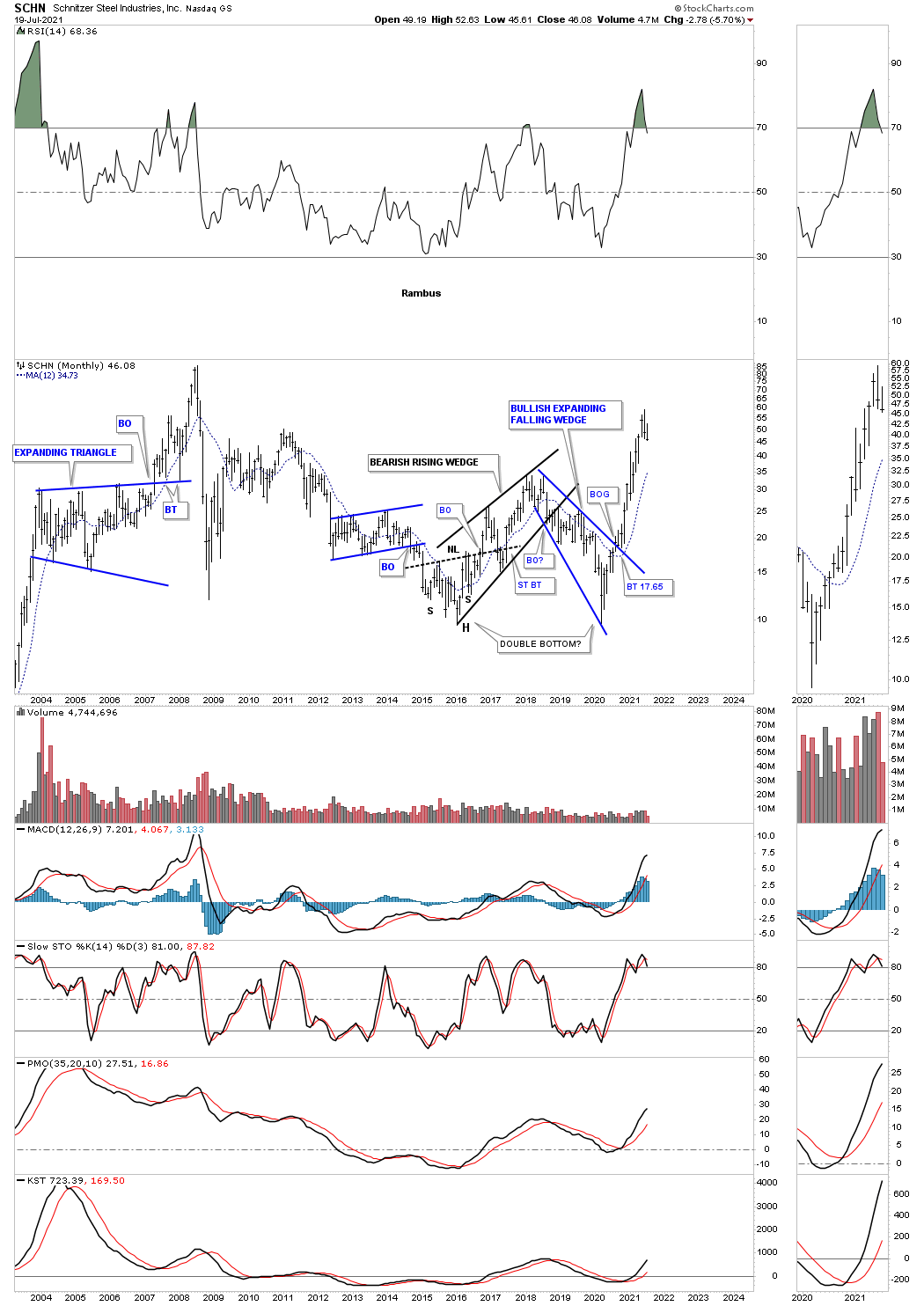
June 2020: SCHN is another steel stock that is forming a possible bullish expanding falling wedge as the right bottom of a possible double bottom reversal pattern.
One year later on July 19, 2021:
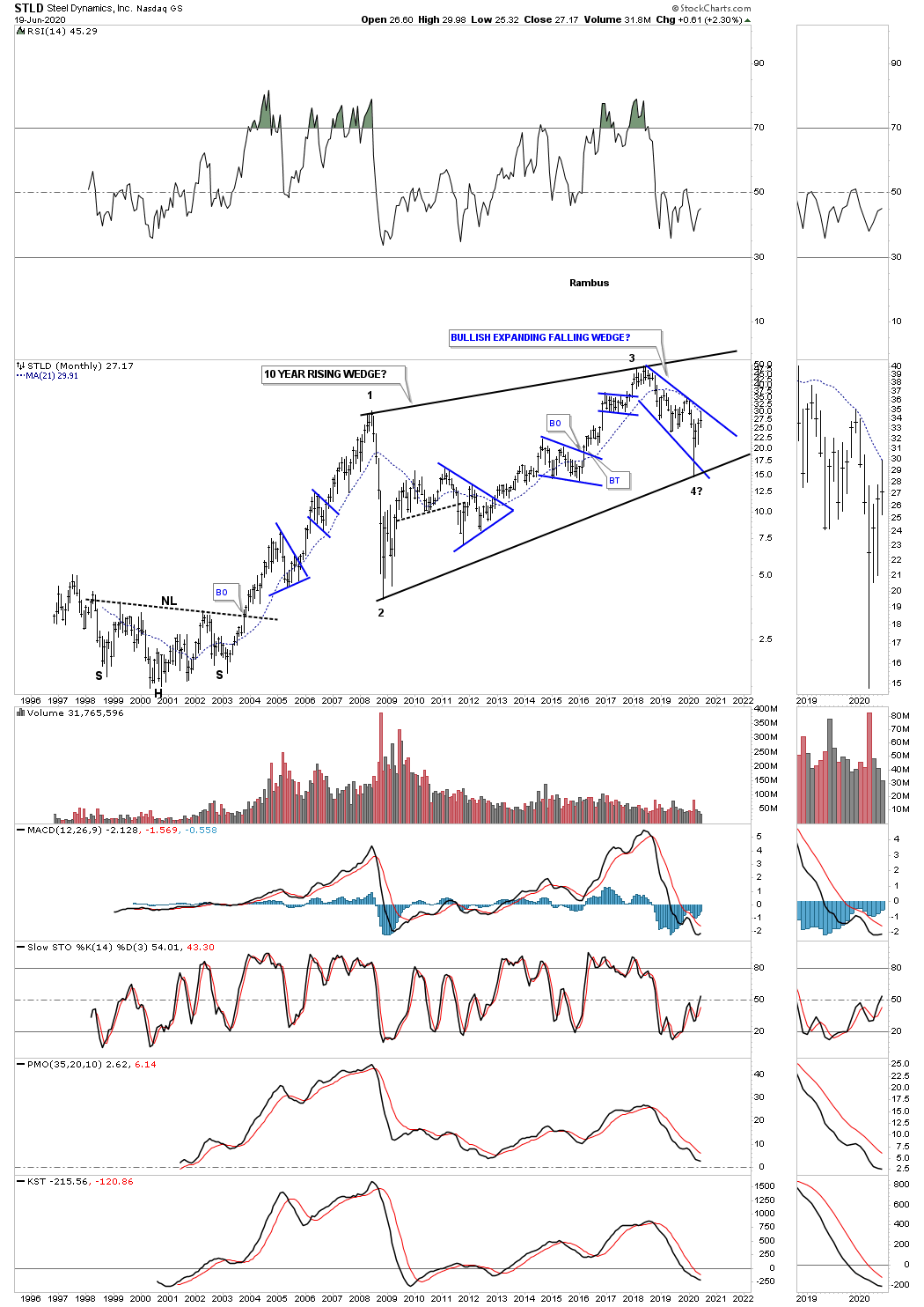
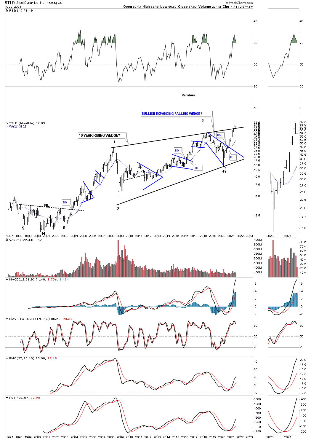
June 2020: STLD is building out a potential very large bullish rising wedge that is 10 years in the making. The blue consolidation patterns show the internal structure of the 10 year rising wedge with the 3rd reversal point completing during the crash low in March of this year. A breakout of the top rail of the blue expanding falling wedge will be a very bullish development as it will suggest a move to the top rail of the black rising wedge and will complete the all important 4th reversal point.
One year later on July 19, 2021:
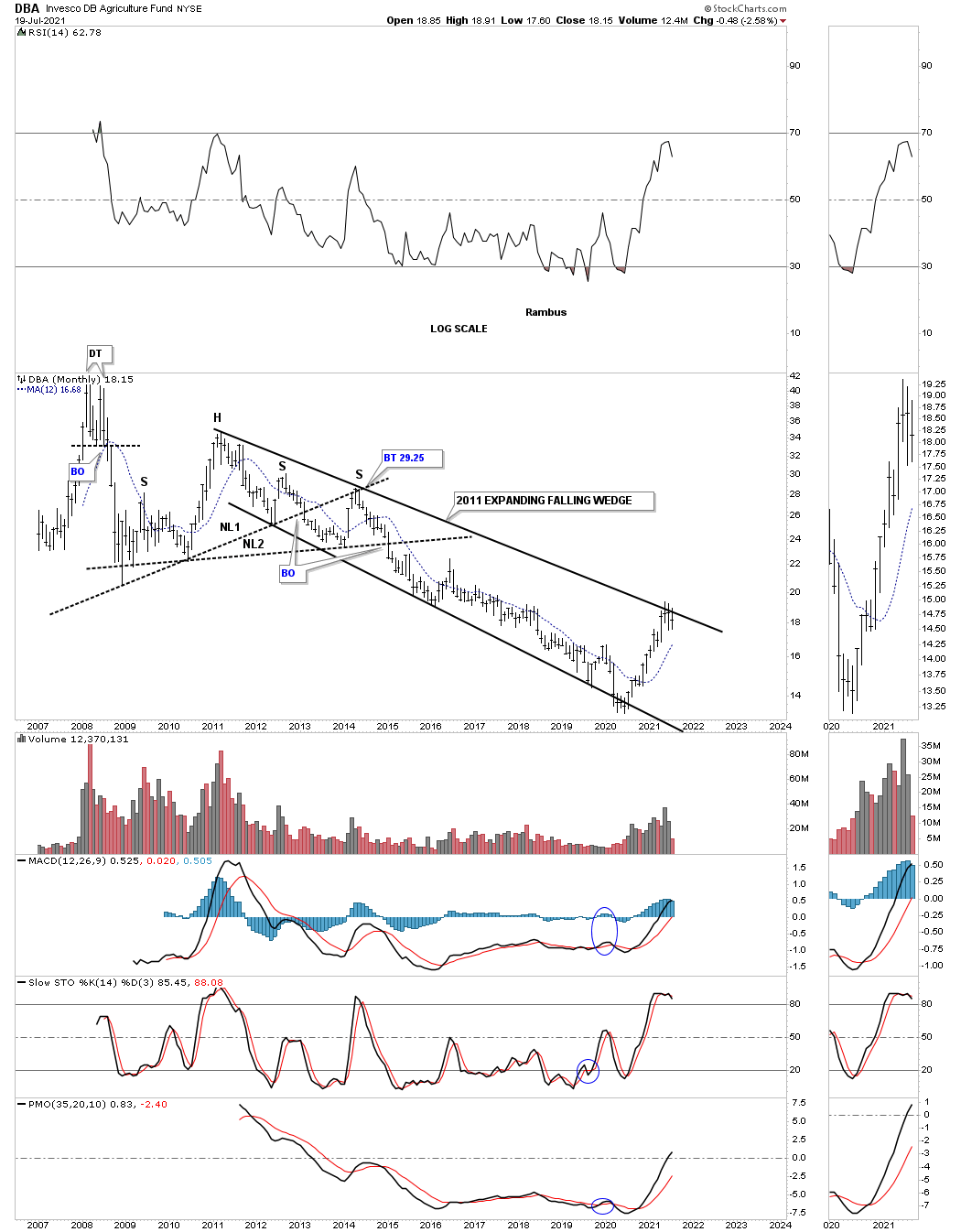
June 20th 2020: The DBA, agricultural fund, has been trending down since 2011 which puts it right up there with natural gas as the weakest areas in the commodities complex.

One year later on July 19, 2021:
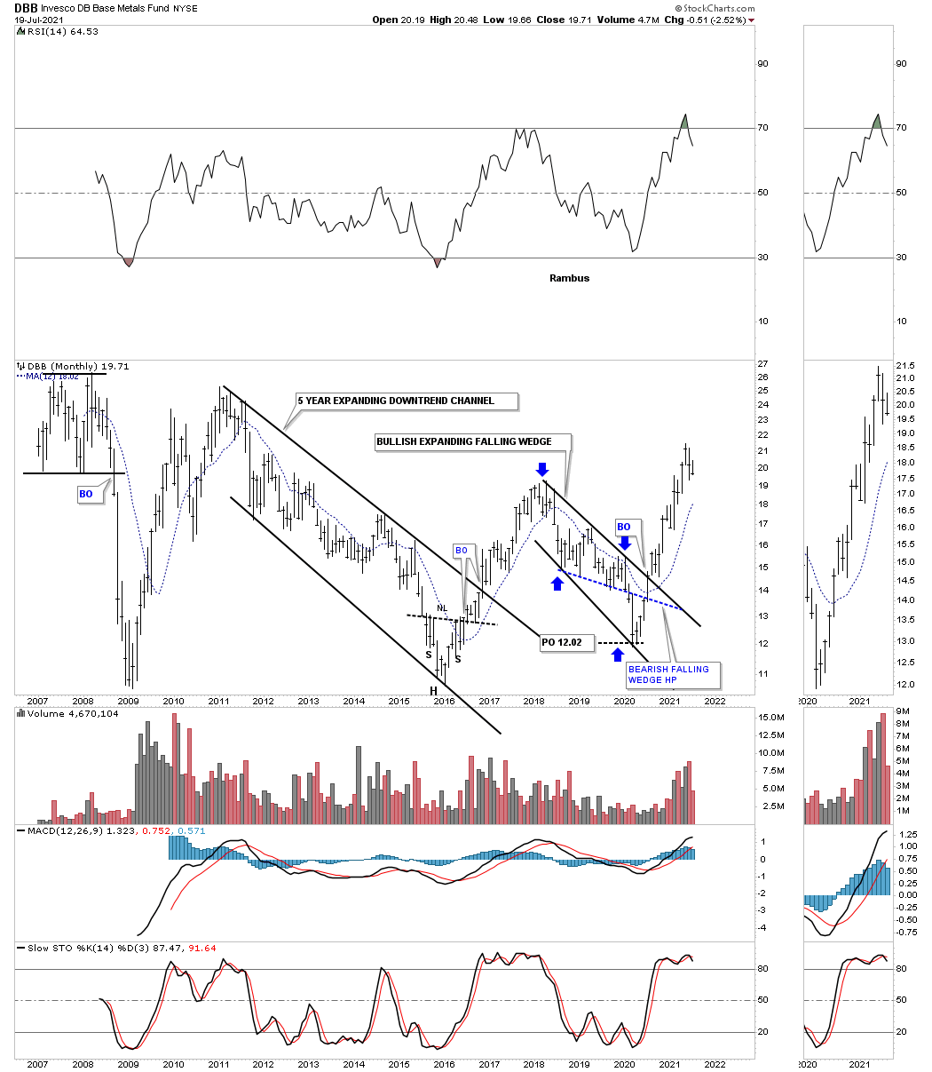
June 20th 2020: The DBB, base metals fund, has been trending lower since 2018 forming a possible bullish expanding falling wedge. The blue dashed line shows the bottom rail of what was a bearish falling wedge halfway pattern which reached its price objective at 12.02 as shown by the blue arrows.
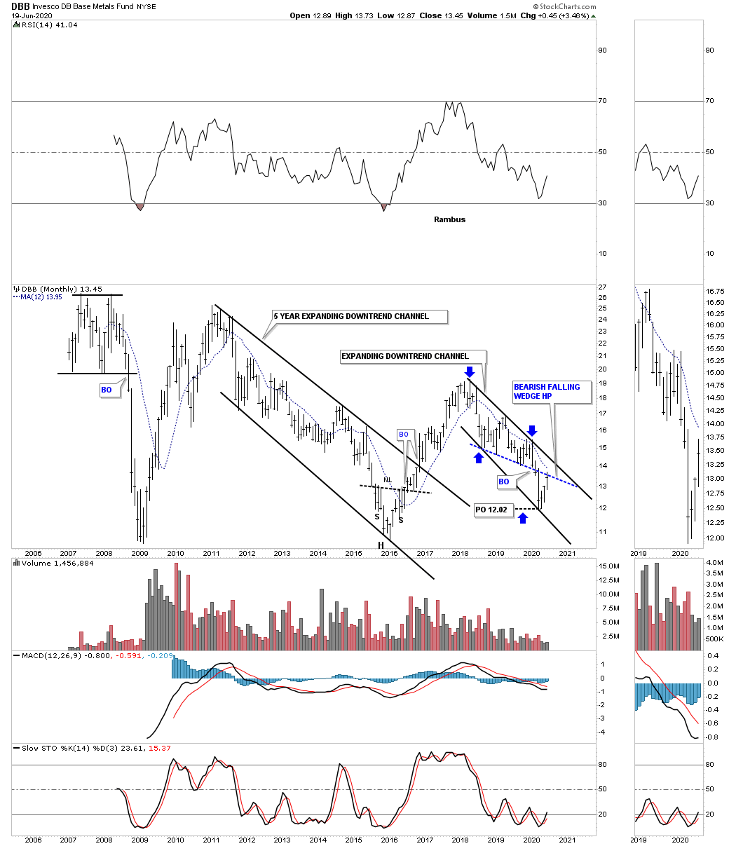
One year later on July 19, 2021:
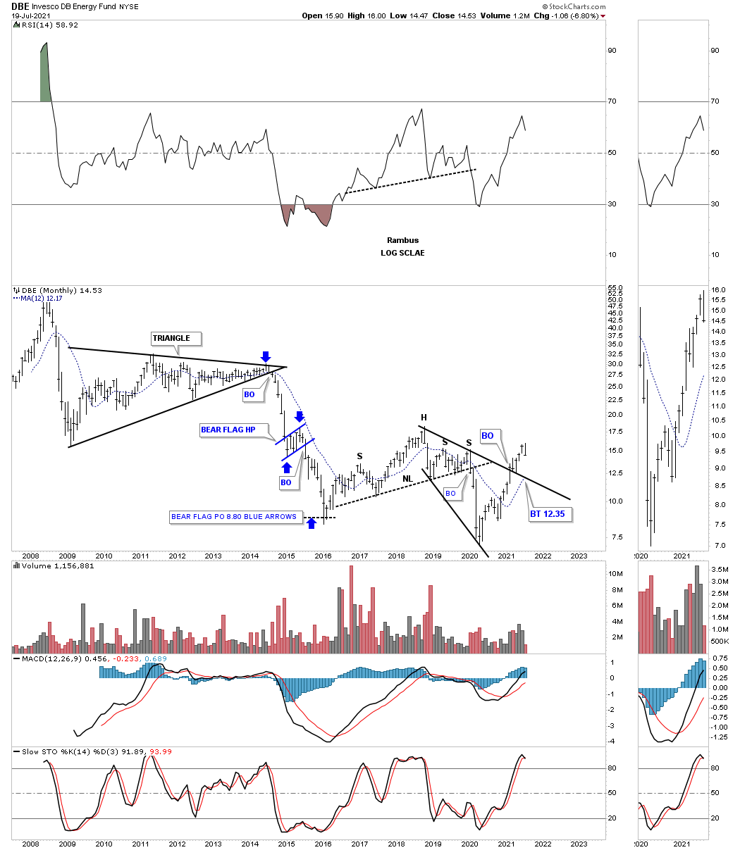
June 20th 2020: The DBE, energy fund, looks to be completing a small double bottom after reaching its H&S price objective at 8.25.
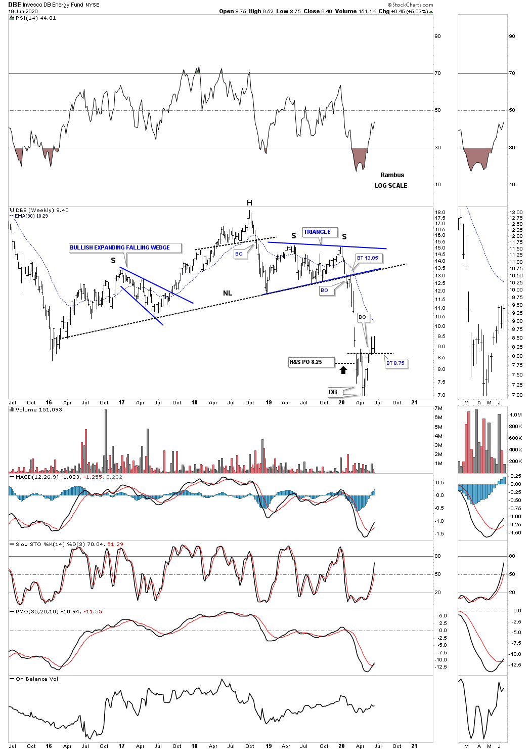
One year later on July 19, 2021:
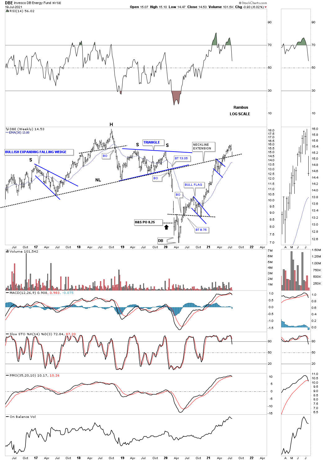
DBE monthly:
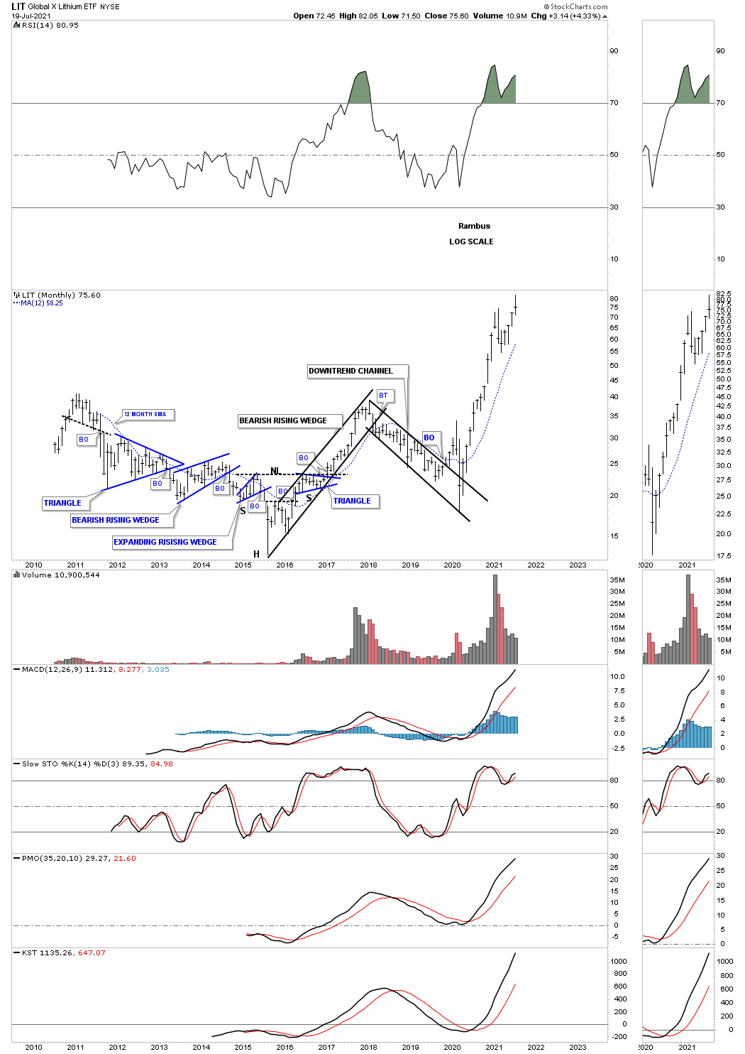
June 20th 2020: LIT, Lithium etf, has been in a strong rally after the crash low in March of this year. It is really not that far off from making a new all time high.
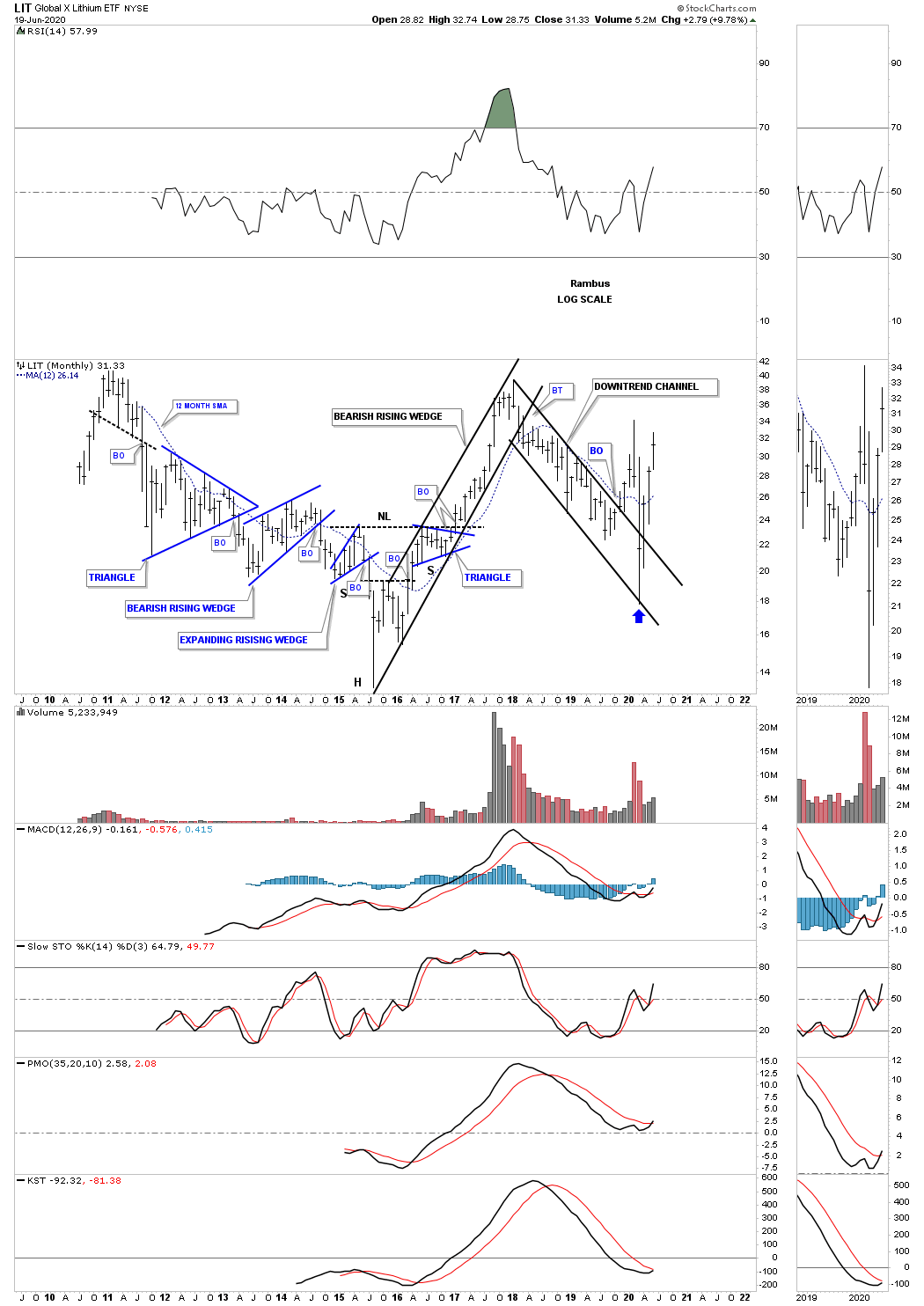
One year later on July 19, 2021:
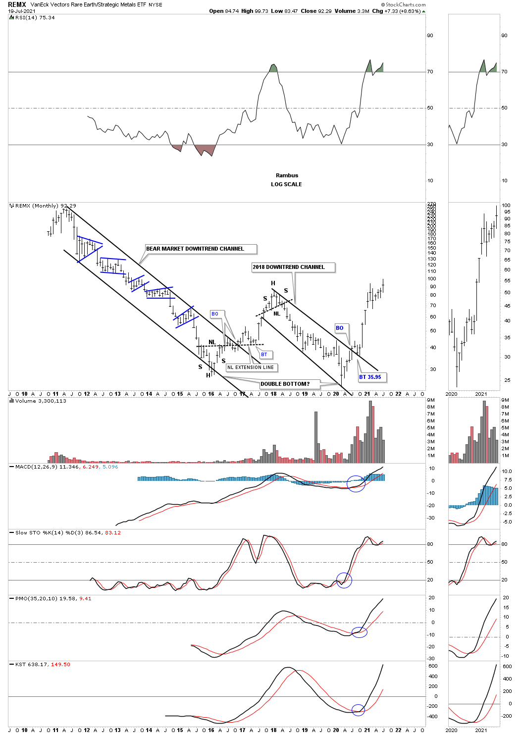
June 20th 2020: REMX, rare earth etf, has been a dog for most of its existence with only one countertrend rally. It could possibly be putting in a double bottom reversal pattern. Note how the price action hit the top rail of the 2018 downtrend channel this month and is backing off. This tells us the top rail is still hot and to be respected. This makes a breakout above the top rail much more important when it happens.
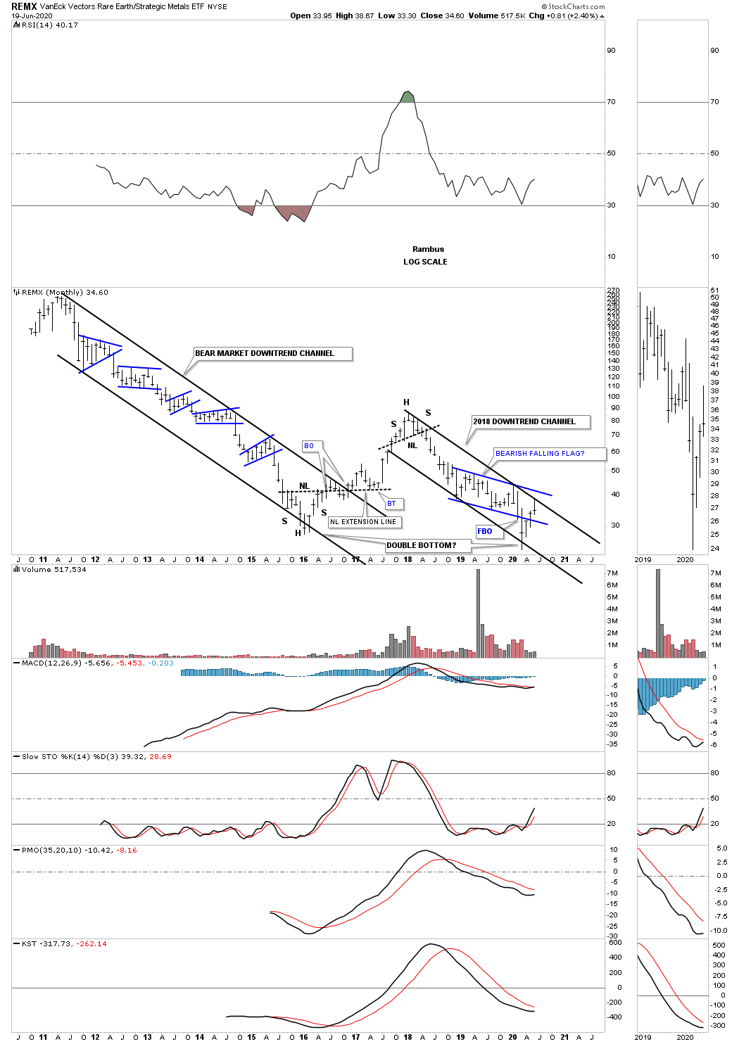
One year later on July 19, 2021:
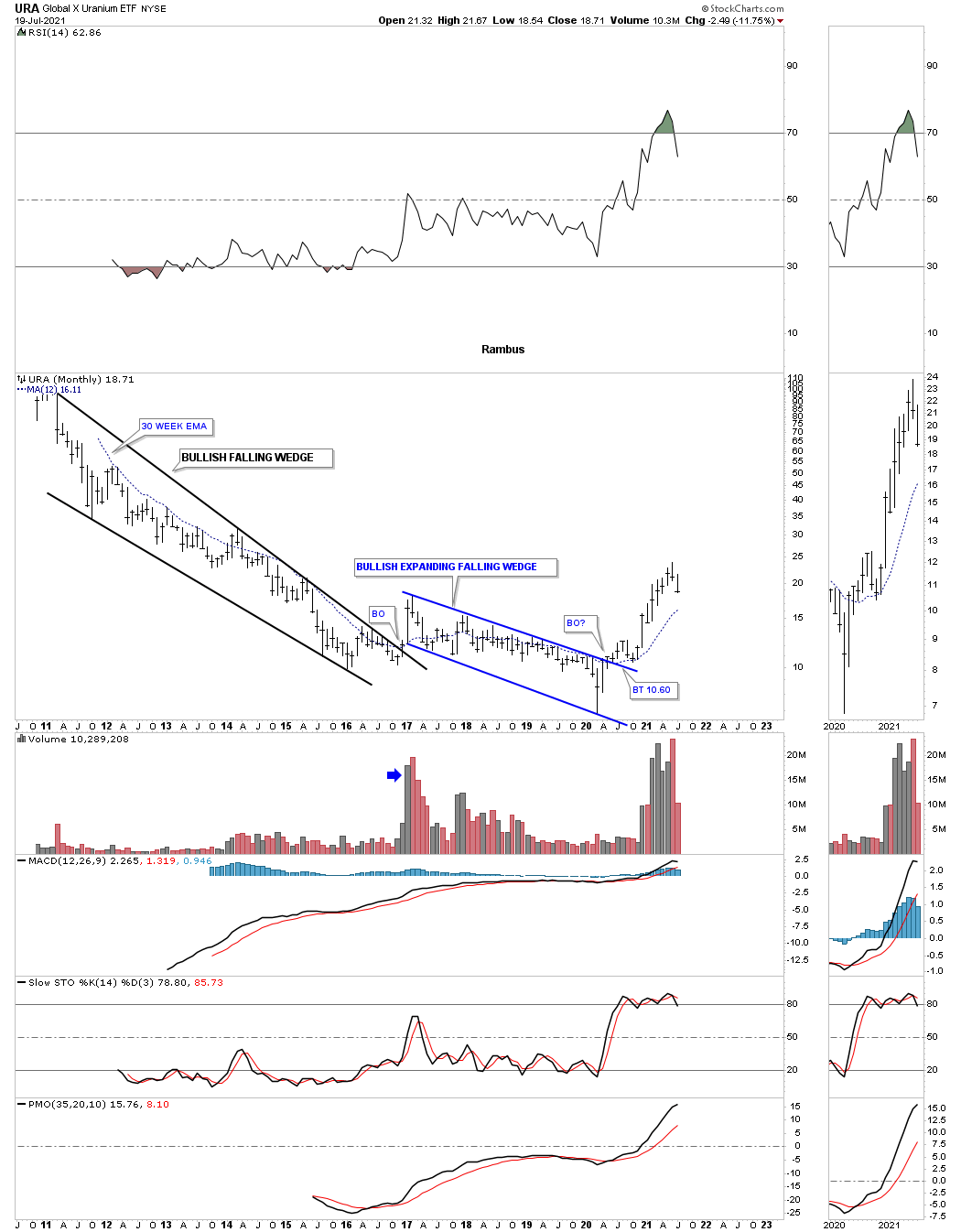
June 20th 2020: URA, Uranium etf, had been very weak for most of its existence but could be showing a little life if it can hold the potential breakout above the expanding falling wedge on the backtest that is currently underway.
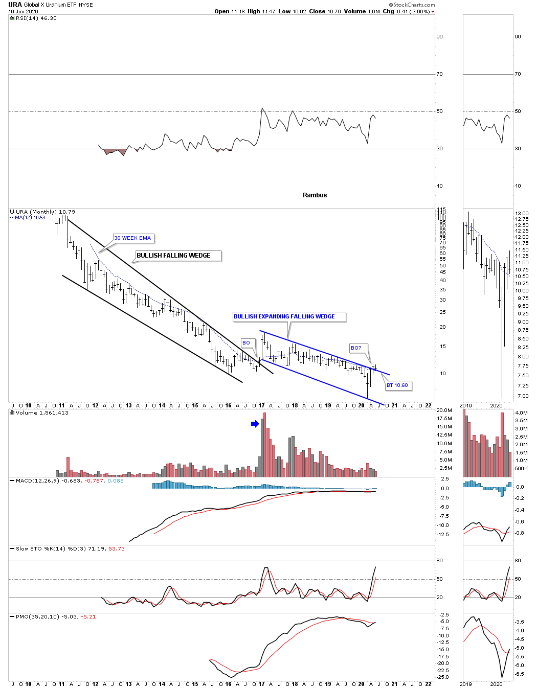
One year later on July 19, 2021:
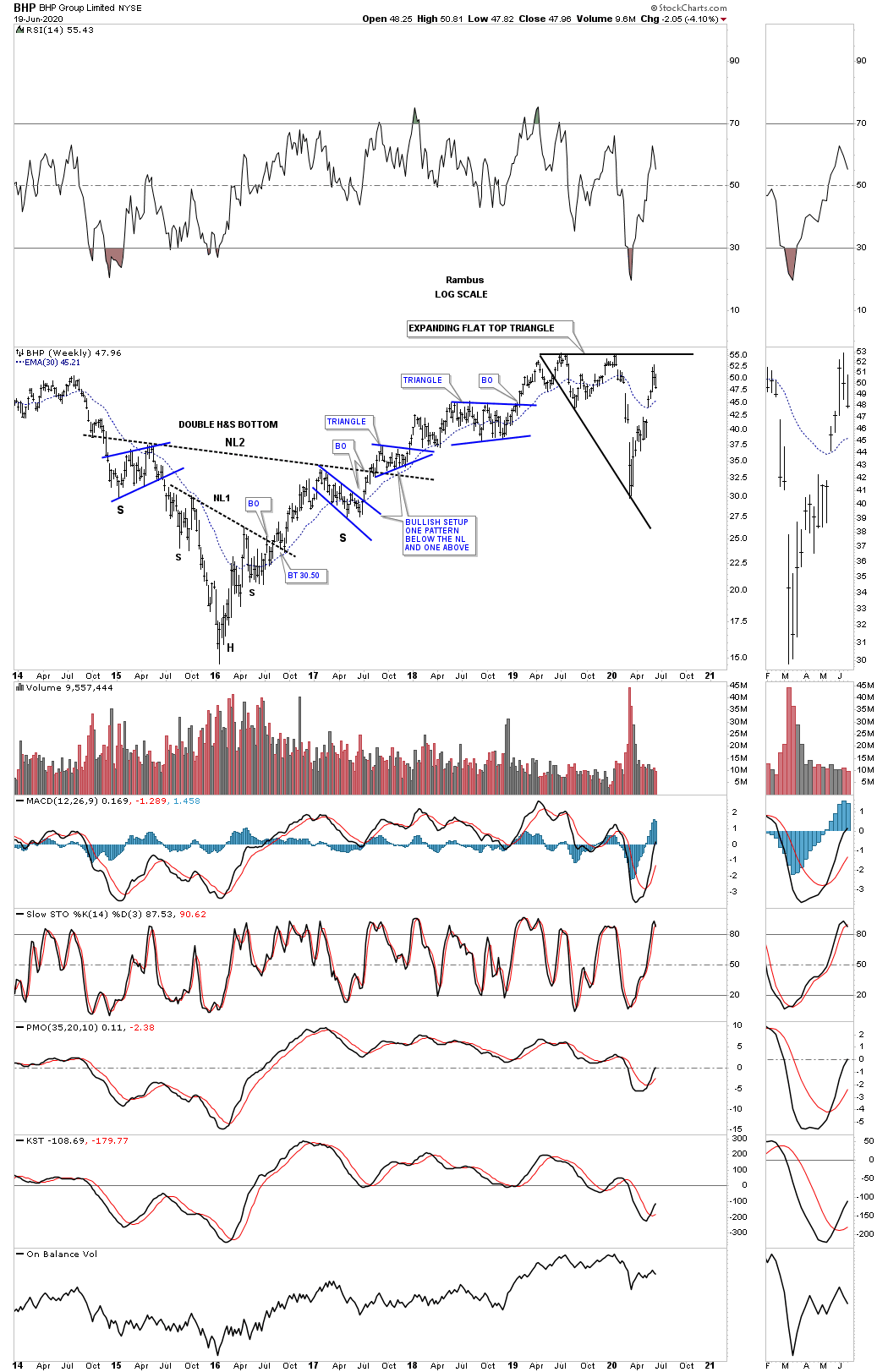
June 20th 2020: BHP is one of the biggest miners in the world and had been doing pretty good until the March crash. It has since recovered most of its losses and is forming a possible flat top expanding triangle.
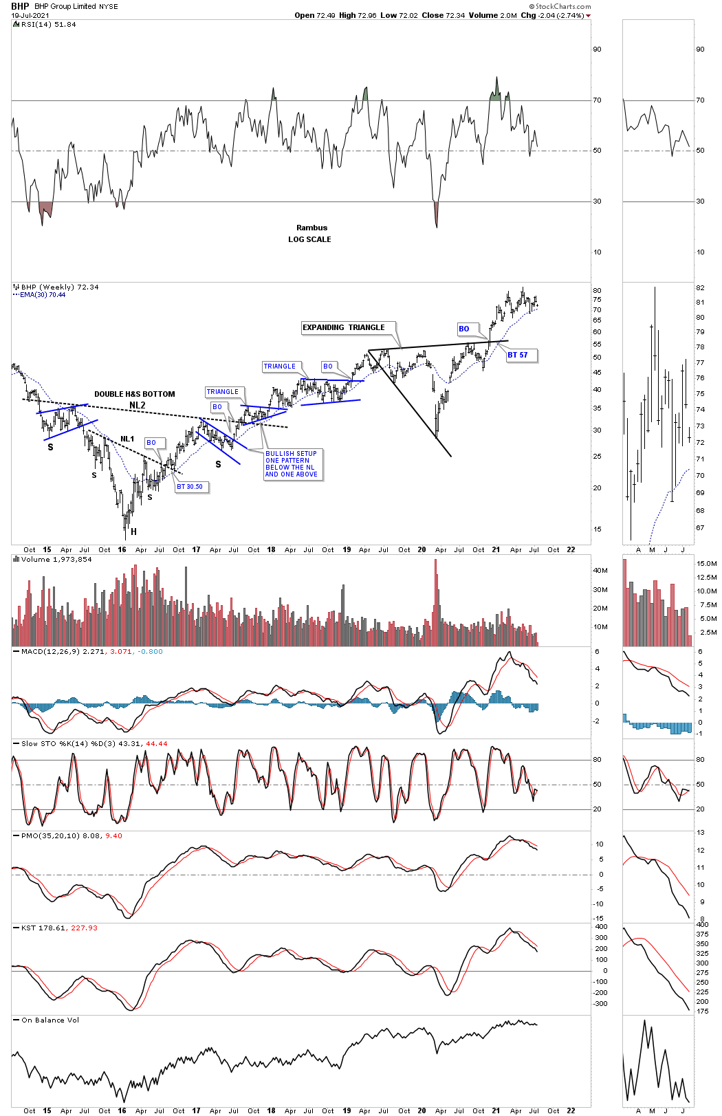
One year later on July 19, 2021:
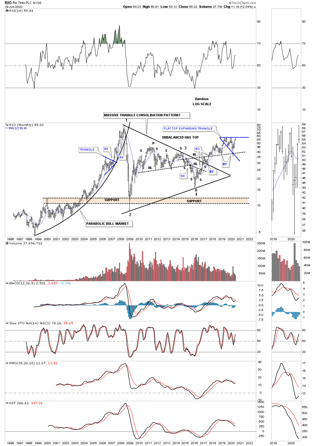
June 20th 2020: RIO is another very large mining company which formed a massive 10 year triangle with the breakout taking place in December of 216 and has been in a bull market ever since. It found support for the 2nd time on the backtest to the neckline symmetry line taken from the 2016 H&S bottom. You can see the price action hit the top rail this month on its blue expanding flat top triangle and is backing off.
One year later on July 19, 2021:

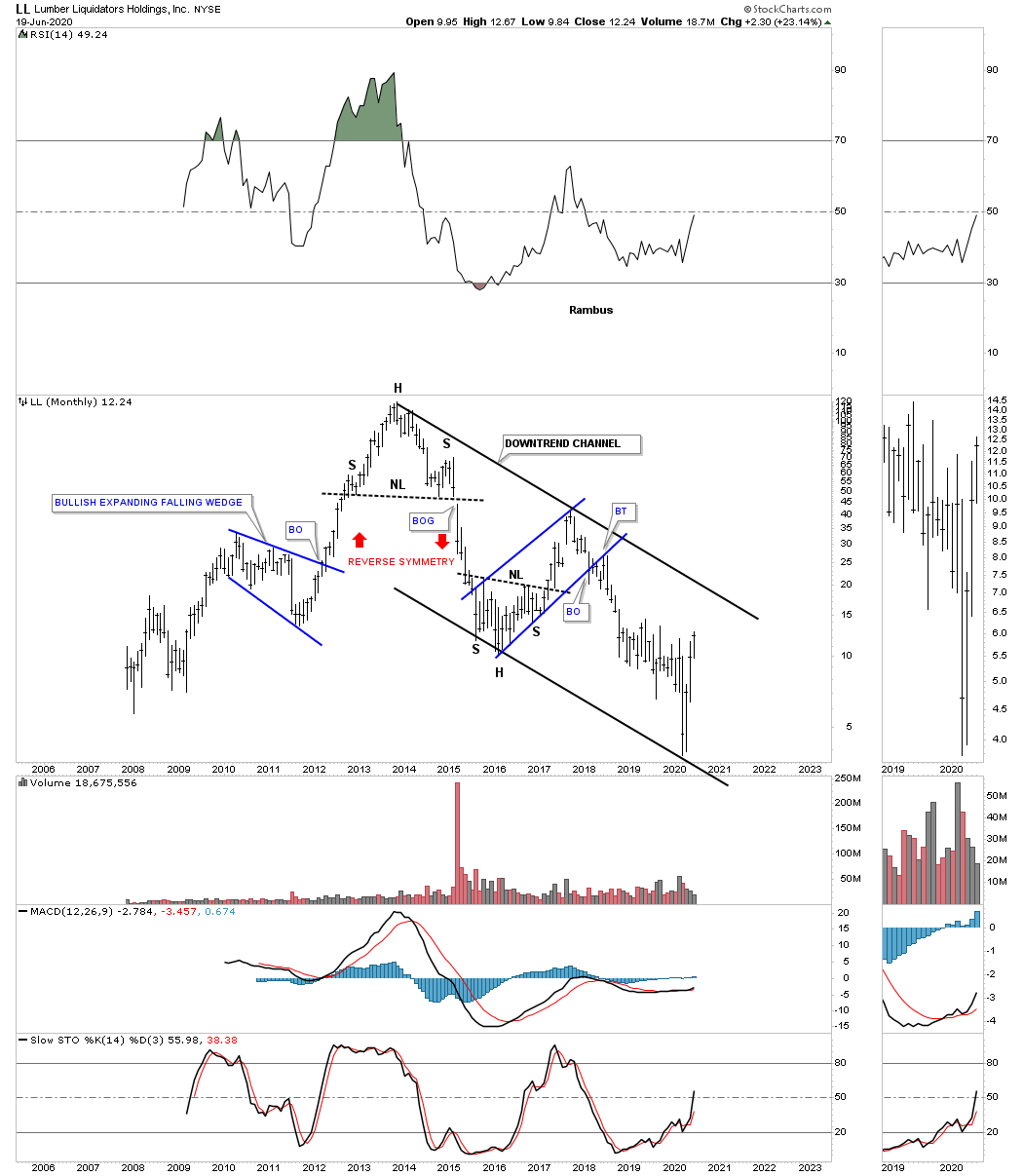
June 20th 2020: LL, Lumber liquidators, is bouncing off the bottom rail of its 2012 downtrend channel.
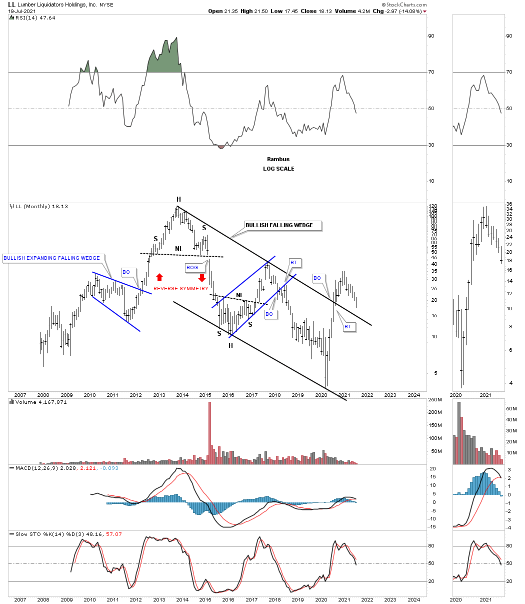
One year later on July 19, 2021:
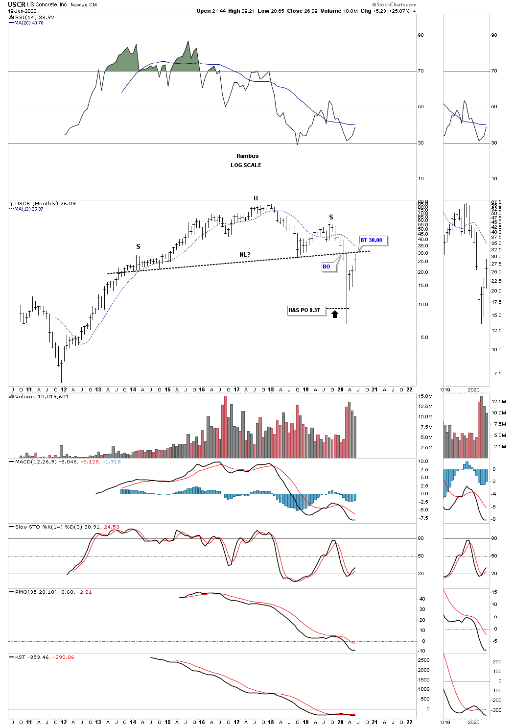
June 20th 2020: After reaching its H&S price objective USCR, concrete, has rallied all the way back up to its neckline. Since the H&S price objective has been met a breakout above the neckline and then the right shoulder high would be a very bullish setup.
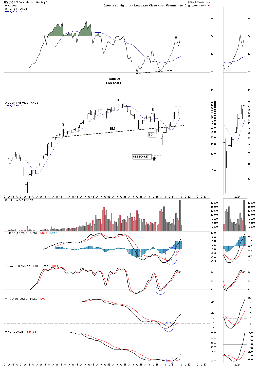
One year later on July 19, 2021:
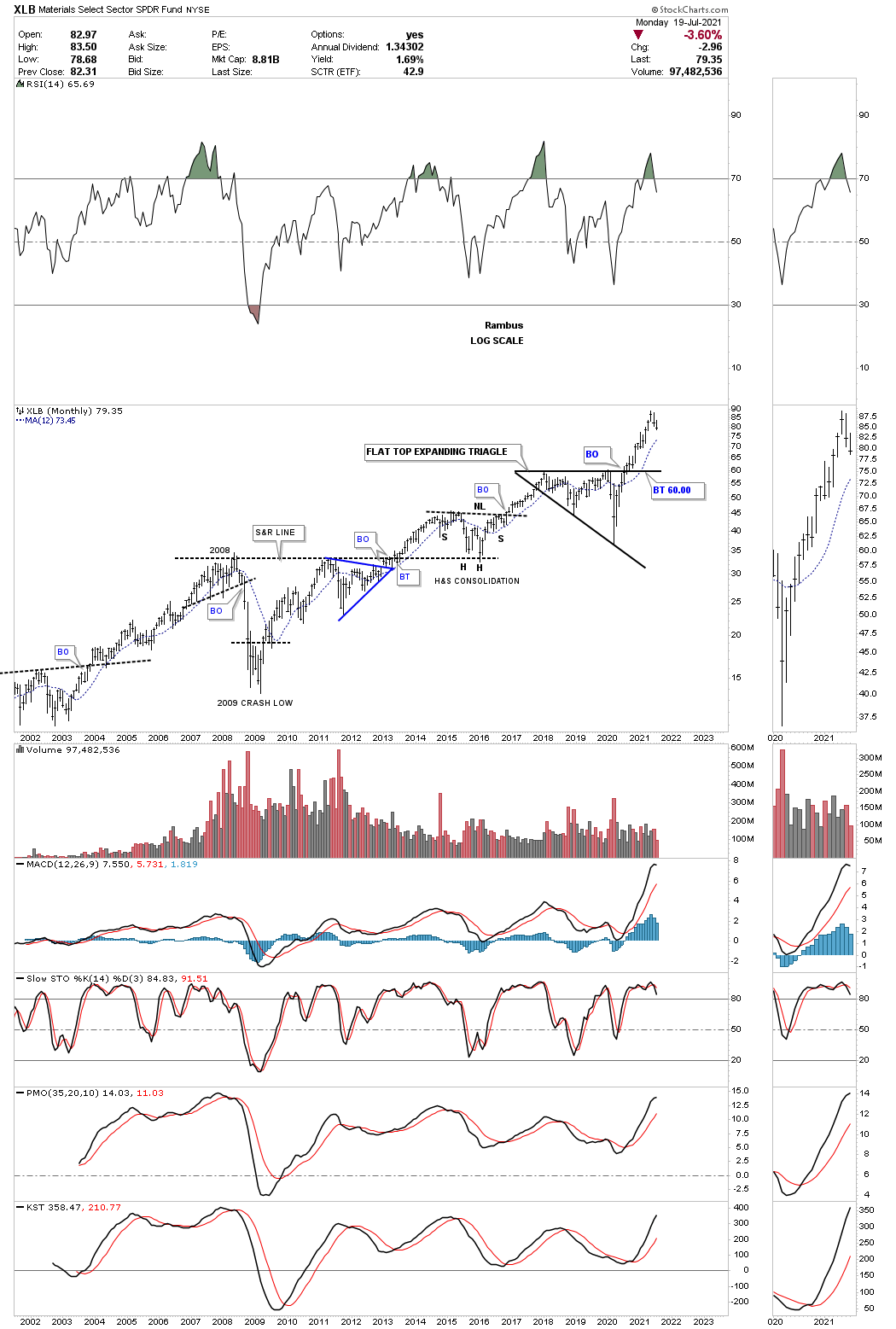
June 20th 2020: The XLB, basic materials fund, sold off hard during the March crash but has rallied back up close to its all time highs. Like several stocks we’ve looked at today the XLB has also formed a flat top expanding triangle which could be a very bullish pattern if we get the breakout above the top rail that will coincide with the other flat top expanding triangles we looked at. There are a lot of stocks in the XLB that are also in the INDU so these 2 can move somewhat together.
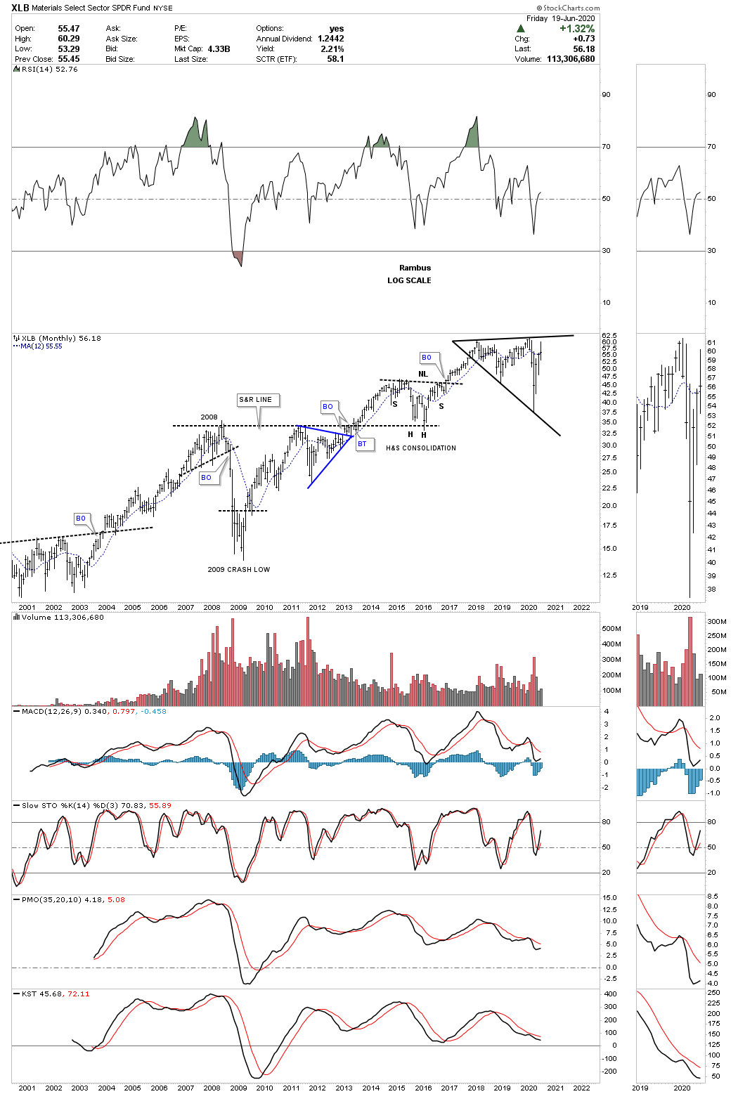
One year later on July 19, 2021:
June 20th 2020:
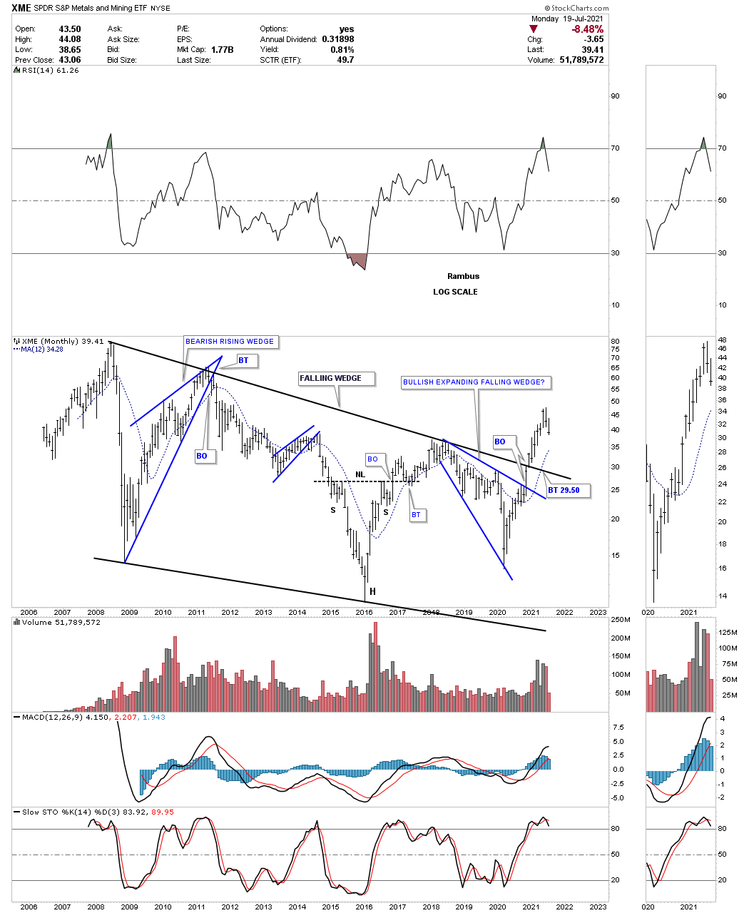
This last chart for this commodities report is the XME, metals and mining fund. This monthly chart shows the entire history the XME and how it has traded in the confines of the falling wedge. It to is building out a possible bullish expanding falling wedge like many other stocks we’ve looked at today.
If we are seeing the actual bottom in the commodities complex there will not be a bell that rings to let everybody know. The environment at an important low is generally pretty muted with most investors not even remotely aware of what is taking place as their main focus is in other areas. When we put all three parts together for this commodity report I think they paint a very clear picture that if all the pieces come together over the next month or so we will have a heads up on most investors. Time to get this posted and get ready for the Father’s Day cookout. Have a great Father’s Day and all the best…Rambus

One year later on July 19, 2021:
PM Complex
Out of the March 2020 pandemic crash low the PM complex enjoyed a very strong rally but was short lived and ended in August of the same year. At the time it looked and felt like the beginning of something and not the end of something. That August 2020 high has proven to be a very formidable high.
The reason it felt like the beginning of something was for the fact that the PM complex also broke out from the 2016 trading range which was then backtested. On the completion of the first backtest all systems were go and all was right with the world. It was exactly what we were looking for and could still be in play but since the hard break to the downside in June, long black candlestick, some red flags went up that urged caution.
Using the GDX as a proxy for the other PM stock indexes, below is a weekly candlestick chart which shows the massive rally out of the March 2020 crash low. Note all the white candlesticks all in a row that formed out of the March 2020 low which shows a classic impulse move. There was about a 6 week correction which backtested the top rail of the double top trendline and then the 2nd impulse move up to the August 2020 high which again had a string of white candlesticks all in a row. At that point it was obvious that the GDX needed to consolidate those massive gains and the correction began at reversal point number one.
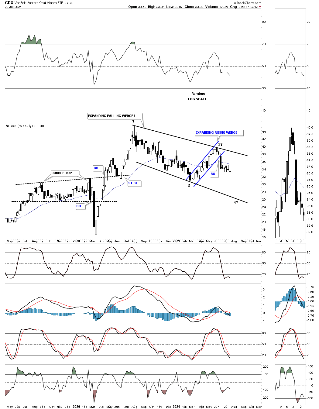
This long term weekly chart shows the 2016 trading range which ended up being a flat top expanding triangle. You can see the initial breakout and backtest to the top of the 2016 trading range and then a decent move to the upside. The height of that rally was the beginning of the 2020 correction that you see on the chart above and the potential head of a H&S top. As the downtrend wore on the GDX found support once again on the top rail of the 2016 trading range and got another bounce which was and still is positive.
The issue now becomes the rally off the 2nd backtest ran out of gas before taking out the August 2020 high and at this point we can see a lower high which could be the right shoulder of an unbalanced H&S top. Keep in mind as long as the top rail of the 2016 flat top expanding triangle holds support the bulls are in charge but if the top rail gives way the H&S top will then be in play which will be a reversal pattern reversing the March 2020 rally.
Note all the other H&S patterns that formed since 2006 with most of them being a reversal pattern. There was one exception during the bear market years where there was one H&S consolidation pattern that ended up being the last consolidation pattern before the 2016 low was hit.
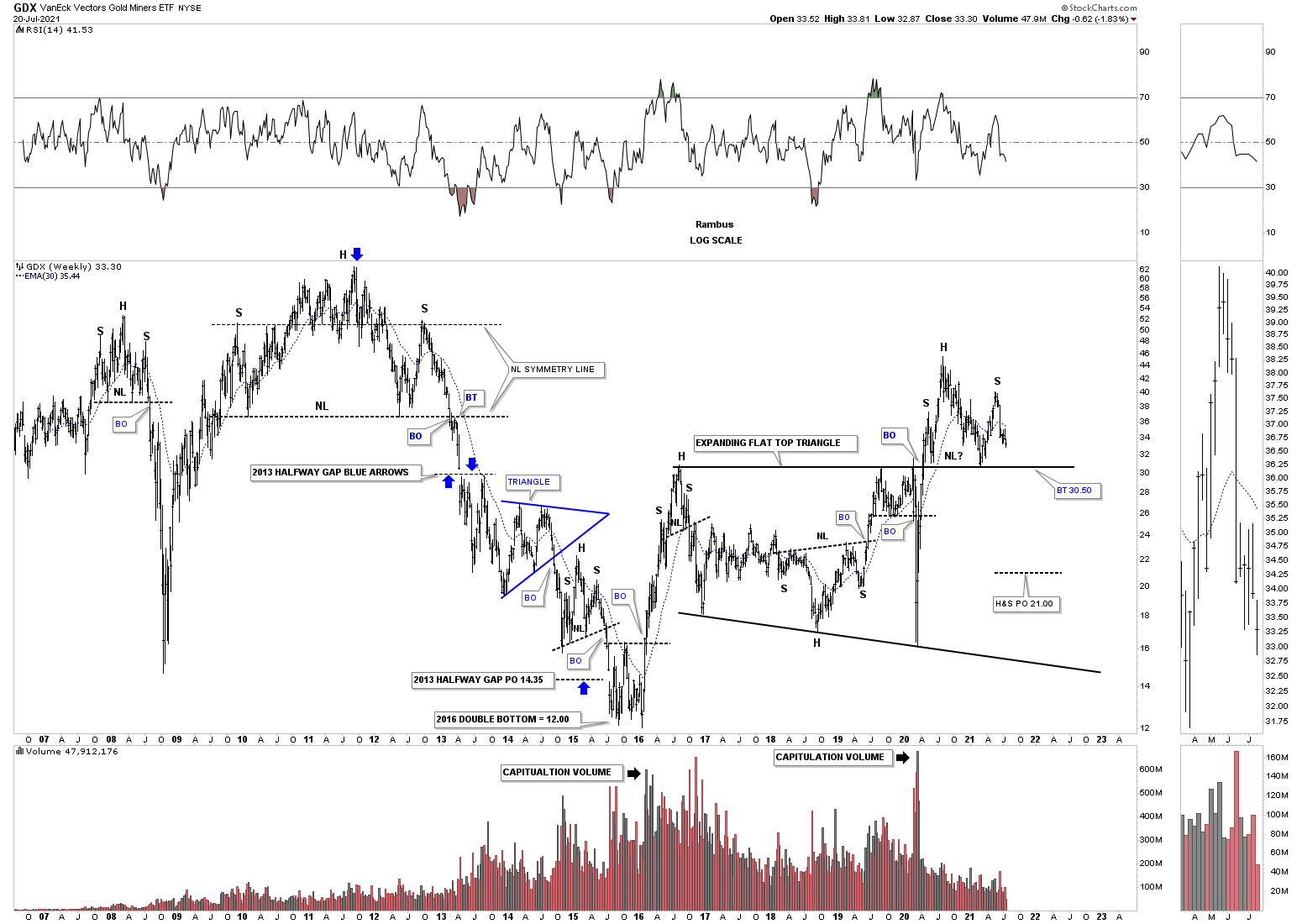
Next is a long term monthly chart which shows the price action since the 2016 low that marks the beginning of the 2016 uptrend channel. If the possible H&S top that is forming on top of the brown shaded S&R zone, that goes all the way back to the 2013 breakaway gap, the GDX will most likely move down to the bottom rail of the uptrend channel. So at this point we have to exercise some patience to see what the GDX has up its sleeves. If we see the neckline give way to the downside then we can become more aggressive using one of the leveraged 2 X etf’s to short the GDX.

Lets turn our attention to the long term monthly chart for Gold which shows a possible fractal building out which would have bullish implications if it plays out. Back at the 2011 top Gold formed a 6 point rectangle consolidation pattern which officially kicked off the bear market. Currently we are seeing a similar rectangle consolidation pattern building out which still has a lot of work to do but as long as the 20 month ema holds support the fractal will remain in play. If Gold breaks below the thin blue horizontal dashed line at1637 the possible fractal will be null and void along with the bullish scenario.
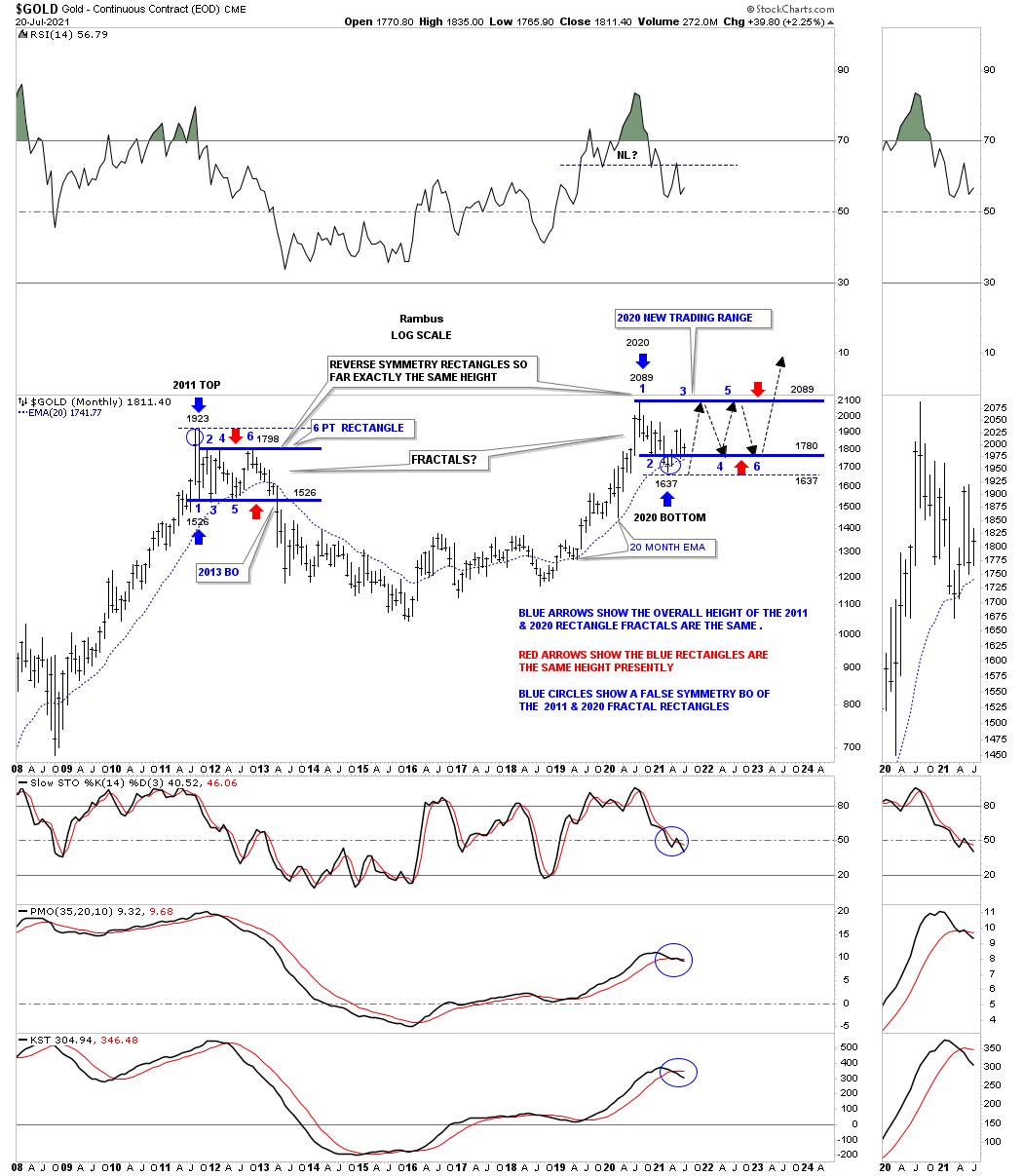
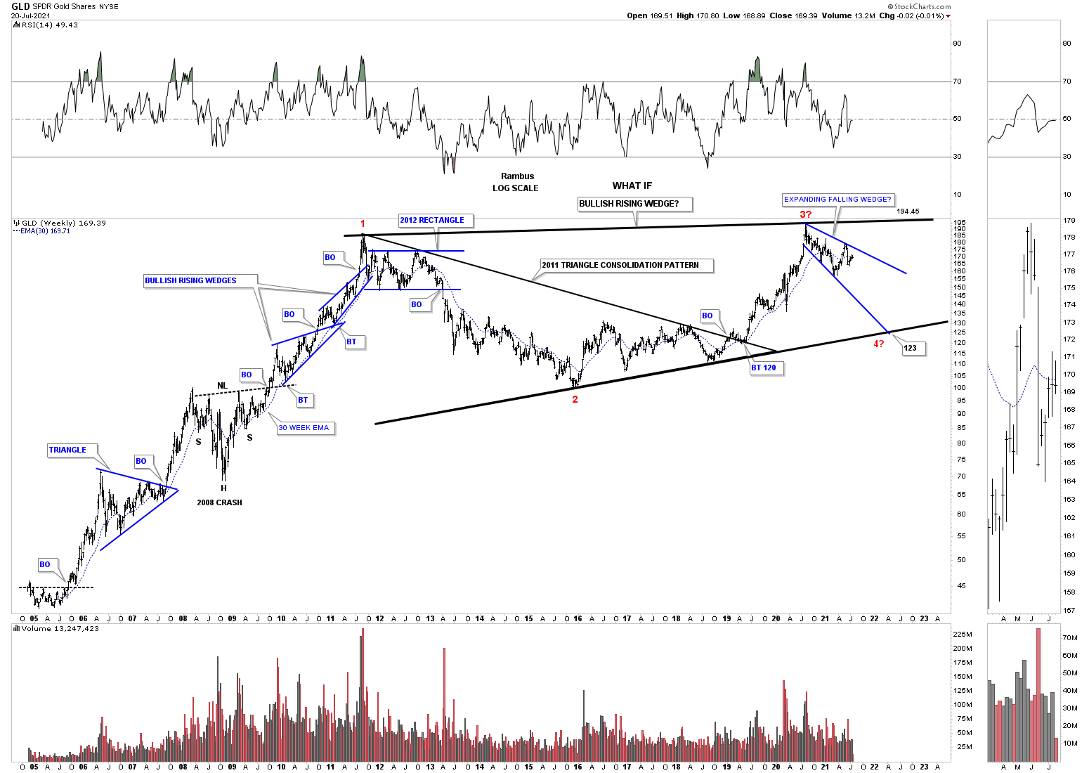
I believe I’ve only shown you this history chart for GLD one time before which shows the potential bearish scenario. If the August 2020 high remains in place that would equate to the 3rd reversal point in red. If that is the case then we should, at a minimum, see a decline down to the bottom rail of what would be a potential massive bullish rising wedge when all is said and done. For now as long as GLD keeps making a lower high and lower low the move down to the bottom rail remains intact.
During the strong impulse move out of the 2020 crash low SLV also produced a vertical move up taking out the top rail of its 2011 bullish falling wedge. After topping out in August of 2020 SLV has been trading sideways forming a possible consolidation pattern. Again, keep in mind this is a long term monthly chart so changes come slowly. If we are going to see the new trading range form as a consolidation pattern we’ll need to see the 4th reversal point form and then a breakout above the top rail which will show the new trading range as a halfway pattern. For the time being the chopping action continues unabated.
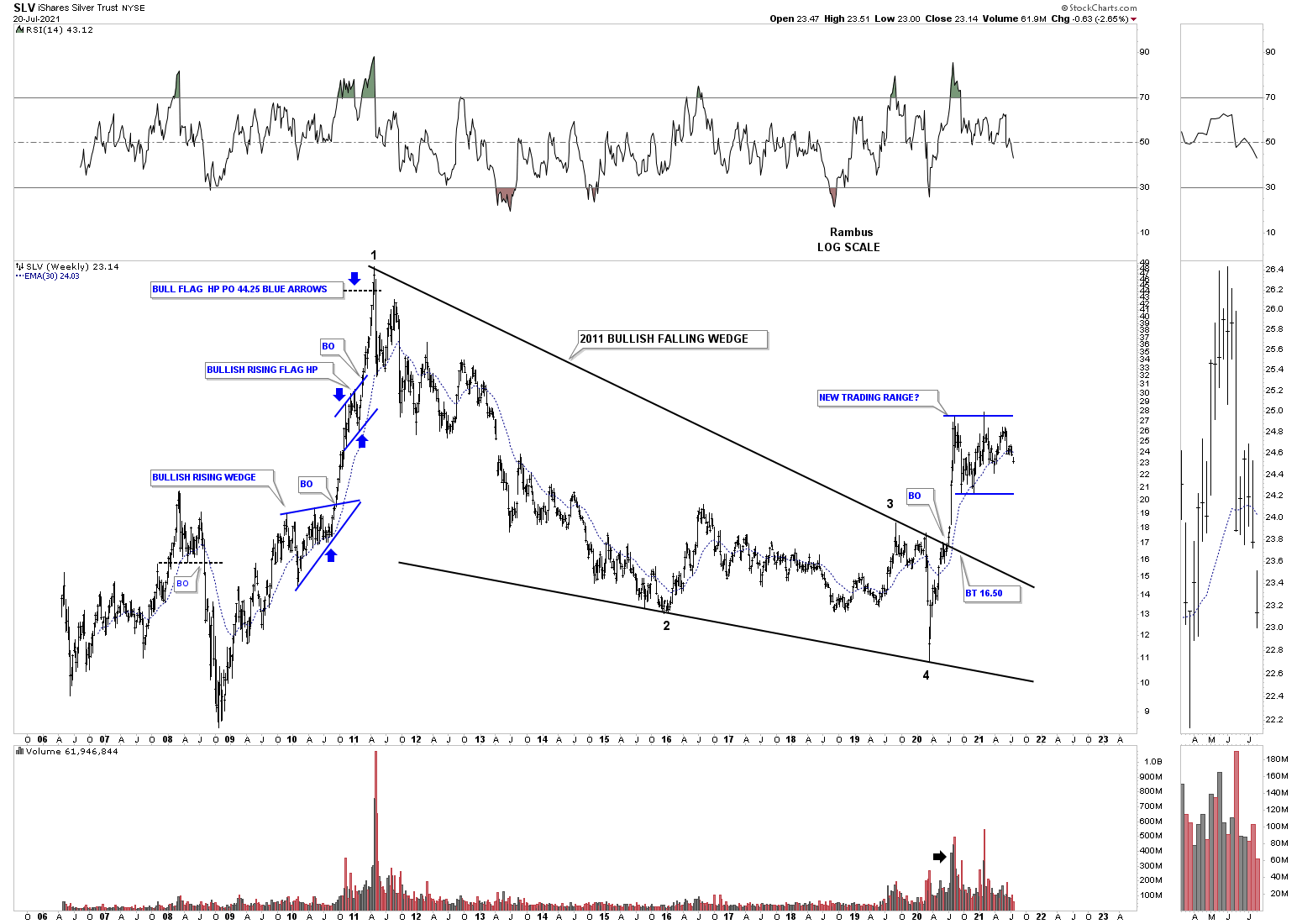
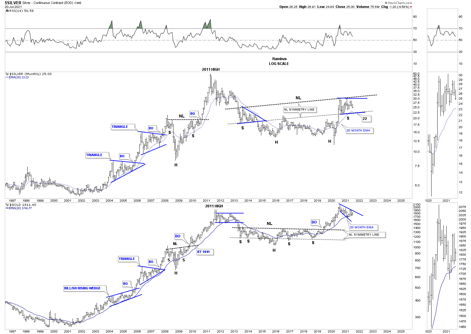
This last chart is a combo chart which has Silver on top with Gold on the bottom. Again, what we are looking for on the Silver chart is for the possible right shoulder to complete and then a move above the neckline. As you can see Gold has already completed its massive H&S bottom and has been finding support at the 20 month ema. If Silver can find support on its neckline symmetry line around the 22 area that would represent a good low risk entry point and just like Gold we could expect a strong impulse move above the neckline.
There are times to be in the market and times to be out of the markets. Currently in the PM complex the prudent course of action is to be out waiting for something definitive to happen. It is always much easier to be on the sidelines waiting for something to happen than to be on the wrong side of the move. The charts above will help guide us on when to get positioned either on the bullish or bearish side of the next important move. All the best…Rambus
Related Reading:
- Rambus: Blockbuster Chartology – April, 2021
- Rambus: Blockbuster Chartology – January, 2021
- Rambus: Blockbuster Chartology – October, 2020
- Rambus: Blockbuster Chartology – July, 2020
- Rambus: Blockbuster Chartology – May, 2020
- Rambus: Blockbuster Chartology – January, 2020
- Rambus: Blockbuster Chartology – October, 2019
- Rambus: Blockbuster Chartology – July, 2019
- Rambus: Blockbuster Chartology – April, 2019
- Rambus: Blockbuster Chartology – January, 2019
- Rambus: Blockbuster Chartology – October, 2018
- Rambus: Blockbuster Chartology – July, 2018
- Rambus: Blockbuster Chartology – April, 2018
- 2017 Annual Wrap Up – Does Your Pension Fund Have A Deep State Drain? – January, 2018
- 1st Quarter Wrap Up 2018 Web Presentation
- Blockbuster Chartology with Rambus – October, 2017
- Blockbuster Chartology with Rambus – July, 2017
- Blockbuster Chartology with Rambus – May, 2017
- Blockbuster Chartology with Rambus – January, 2017
- Blockbuster Chartology with Rambus – October 20, 2016
- Blockbuster Chartology with Rambus – July 21, 2016
- Blockbuster Chartology with Rambus – April 21, 2016
- Rambus: Are We in a Deflationary Spiral? – January 28, 2016
- The Dollar, Gold & the S&P 500 with Rambus – October 15, 2015